
Once the job is run (after clicking the  Run Job button) a window is displayed showing the progress. Similarly to ND2 acquisition blue rectangles representing dimensions or frames turn green when captured. The window shows the analysis results immediately during the job after the analysis is done. Some tasks require user interaction during the job progress (e.g. Stage XY Points >
  Add/Edit Points Manually) and other tasks can be forced to do it as well if you check Show at runtime (Defining Parameters). Once the task definition dialog shows up, the Job execution is paused until user confirms settings modification by pressing .
The following picture shows a well plate selection of 6x10 wells being scanned. Green color indicates which wells have been already captured, yellow indicates the well being scanned at the moment (C9).
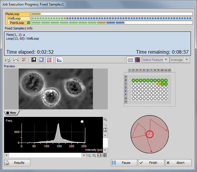
Figure 1100. Job Progress Visualisation
 Auto Contrast
 Automatically adjusts contrast value in the Preview image.
 Reset Contrast
 Resets the contrast value.
 View Binary
 Displays the binary layer in the preview.
 View Color
 Displays the color layer in the preview.
 View Overlay
 Displays the color layer and the binary layer in overlay.
 Hide Histogram
 Hides/Shows the histogram below the preview.
 Show Well Plate
 Displays the Well plate view.
 Show Heat Map
 Displays the Heat map view. Average or Last values of the Feature selected from the first combo box can be shown above the heat map. (Choose a feature that is displayed during the job progress and select the last or average value - it displays a number of the Runtime steps.)
 Results
 Opens the Job Results dialog window (see: Running a Job, Viewing Results and Graphs).
 Pause
Pause Enables the user to pause the experiment - then the button changes to  Continue. For example: if your job does not perform auto-focus before each frame but you see that the preview image is getting blurry, you may pause the acquisition, re-focus and then start it again by clicking Continue.
 Finish
 When clicked, only images captured so-far will be saved, the experiment will be ended.
 Abort
Abort Click this button to end the experiment without saving any data.
Note
Right-clicking on the image preview enables the user to move the stage to keep an object in view manually using the  Move this Point to Center command. Context menu over the well plate can be used to display a Schematic View of the well plate, show a scale bar (Show Scale) or move the stage to the selected well, to a cursor position or to the stage center. Context menu over the well preview can be used to display a scale bar.
(requires: JOBS View)
Once the job run is finished, results are saved automatically and the Job results window opens. To open some other saved job results, select the particular job/job-run in the Introduction to Jobs Explorer and click Results. The Job result window shows captured images and all associated captured data of a single job run.
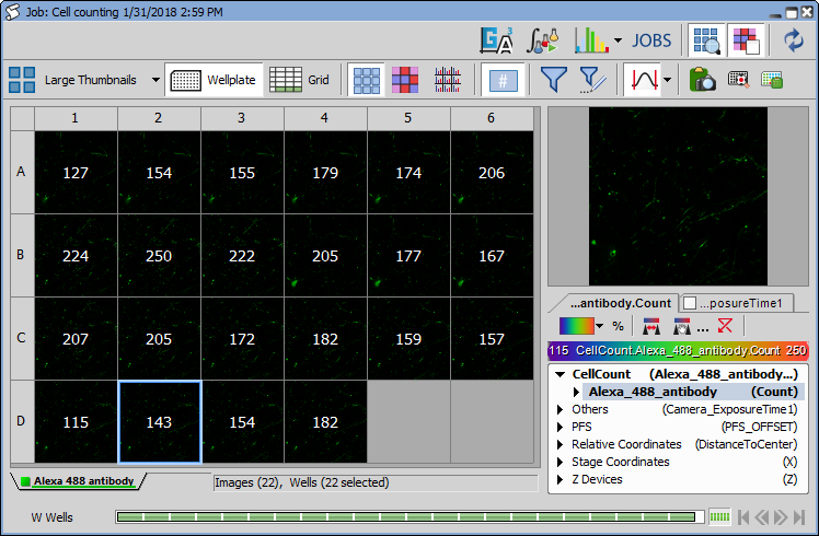
Figure 1101. Job Results window
This picture shows a result of a well-plate experiment displaying preview of the captured images in each well. If multiple images are captured in a single well, they are automatically stitched into a single large image.
Basic dialog areas
Basic navigation is done using the ND navigation bars in the bottom part of the dialog window. Right side shows a preview of the selected well/frame with heat-map controls and acquired data browser.
The Job results window views the results from “various angles”. There are three basic views:
Thumbnail view
Wellplate view (if wellplate was used during acquisition)
Grid view
In Thumbnail and Plate view you can view Images, Heat-map of selected data values (Quantities, Acquisition metadata and Analysis results) and labels (in case of wellplates). Grid view displays all results in a tabular form.
ND2 Interconnection
Double-clicking an image in the result view opens the underlying ND2 file with that particular image frame displayed. If the job consists of multiple ND files, just a single image window stays open. To display each ND2 file in a separate window, use alt + double click. Both options are available also on the context menu.
Reusing a Job Definition
ND2 files created in Jobs are saved together with their Job Definition. To display or reuse this definition, simply right-click on the opened image and choose Reuse Job Definition.
Top Toolbar options
 Huge Thumbnails,
  Large Thumbnails, etc.
 Thumbnail view displays all acquired images in the order of acquisition. Channel displayed in the thumbnails can be selected in the tabs below the thumbnail view.
Wellplate Real layout of the plate is displayed.
 XY View
 Any captured multipoint frames are visualized as a single image.
 Grid
Grid Images along with metadata are displayed in a grid (see below). Filtering and grouping is supported (you can sort and group by any column). Statistics can be turned on. See Figure 1105, “Job Result: Grid View”.
 Show Images
 Displays all acquired results as images.
 Show Labeling
 In the wellplate or thumbnail view, this button displays color labels for each well if the labels were defined.
Show Heatmap Independently on the current view (thumbnails, well plate, grid), you can select a heat-map which represents one of the meta-data values (e.g. analysis results, gas concentration, temperature, etc.). In the heat-map view you see the selected colored squares instead of images. The color is based on the value and can be tuned. If multiple data are acquired in one well/frame (e.g. when multi points were captured in each well of the well plate), it is possible to aggregate these data (calculate min, max, mean, sum, SD, etc.) in order to get a single value per well. If one of the aggregating features is selected from the combo box, entire multi point bar is selected and the results show the aggregated values. If one multi point is selected in the multi point control bar, Aggregate combo box is automatically switched to None, displaying only non-aggregated results of the currently selected multi point.
An example of a heatmap is displayed in the following picture. Displayed as thumbnails, each image is overlaid by a color and a value both of which carry information about the meta-data selected in the bottom-right corner of the window. By default the color range of the selected feature uses minimal and maximal values found in the entire job run. The color scale range and colors can be modified by the user.
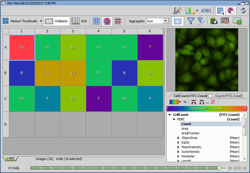
Figure 1102. Job Result: Thumbnail View (Heatmap)
Note
Select the meta-data to be displayed in the heat-map in the Quantities panel (bottom-right area of the window).
Displaying two features in a heatmap
Heatmap mode can be used to view two features at once. Open the Quantities panel and select a feature to be displayed from the first tab. Then check the second tab and select a feature. Both features are now displayed in the heatmap. Use the Properties Compare Mode button to switch to the  circle diameter mode or back to the
  divided mode.
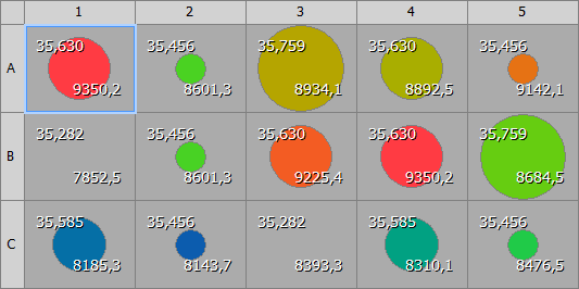
Figure 1103. Circle diameter mode
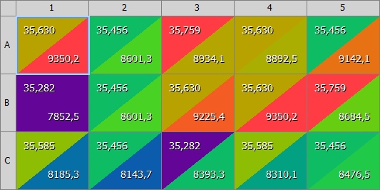
Figure 1104. Divided mode
 Show Histogram
 Data of each image are represented by a histogram.
Aggregates data by the selected feature.
 Time Trend
 Time trend represented by arrows for each image can be displayed using this button.
 Show Feature Values
 Displays a numeric value of the selected feature over each well.
 Use Filter
 Activate this button to filter the results. The filter can be defined by clicking the button.
 Define Filter
 A filter may be applied to images displayed in the result view. Click the button to display a table with the filter definition. Toggle the button to turn the filter ON and OFF.
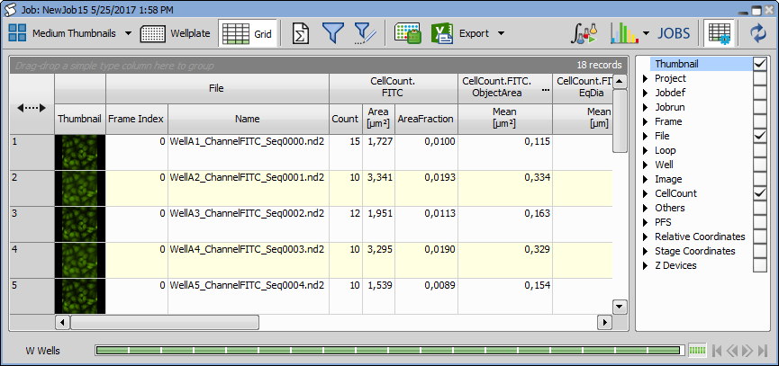
Figure 1105. Job Result: Grid View
Auto Scale Intensity Performs automatic setting of LUTs on the image thumbnails. Click on the pull-down menu to reveal LUTs options. Scaling can be based on a selected image (Scale From Selection) or all images (Scale From All Loaded). To adjust the LUTs settings, select Modify LUTs....
 Export View
 Exports the well plate overview.

 Show Selected Well/Jump to Wellplate
 Switches between single well view and well plate view.
 Import Metadata
 To assign prepared labels and metadata to the wells displayed in the result view, copy the metadata inside your spreadsheet application and click this button. Please see Importing predefined presets from spreadsheet applications for importing prerequisites.
 Run General Analysis 3
 Opens the Run General Analysis 3 on Jobrun dialog window where it is possible to choose an analysis which is executed on the selected jobrun.
 Run Analysis
 This button runs an analysis on images captured using a job definition. See Analysis.
 View Graph
 Click the black arrow next to this button to choose a graph view from the list. Then click the button to open the selected graph view. For more information about viewing results in different graph modes, please see: Graph View.
 View Definition
 Click this button to display the job definition window. See Job Definition Window.
 Grid Settings
 Shows a table with all acquired metadata. Each feature can be displayed or hidden in the Grid View using the check boxes.
 Show Preview
 Display or hide a small image preview window.
 Show Labels
 Display or hide the labels toolbar. Labels of the wells selected in the wellplate layout are highlighted here. Any label can be temporarily turned off by unchecking the check box next to its name.
 Show Quantities
 Display or hide the Quantities panel showing image metadata.
 Refresh Contents
 Hit this button to refresh the currently displayed results.
Quantities toolbar
This button indicates the currently selected color gradient which is applied to the data results view. Click on the button and select a predefined gradient or choose Manage Custom Colors... to define a custom color gradient. Please see  View > Image > LUTs > Create Custom LUTs describing the gradient definition on a similar dialog.
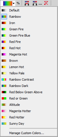
Figure 1106.
Feature values are represented by their percentage. 100% is assigned to the maximal and 0% to the minimal value.
 Set range from current view
 This button assigns the left color to the lowest value and the right color to the highest value present in the current data results view.
 Set manual range
 Applies the custom minimal/maximal scale range. Click the button and enter the minimum and maximum values to be used instead of the default ones.

Figure 1107.
Click to apply the manual scale range.
Set maximum range Any manual scale changes are turned off and the default (widest) range is applied.
(requires: JOBS View)
Clicking on the View Graph icon in the result view opens the graph view.
Note
To display different graphs of your results, click the graph button to expand a combo box containing more options.
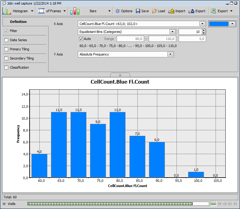
Figure 1108. Histogram graph view
Top toolbar options
Graph selection The first button is used for selecting the graph type.


Select whether your graph results are related to image Frames, binary Objects or Tracks.
 Graph sub-type
 Specifies the graph sub-type. Following types are available: Histogram,  Scatterplot,
  Barchart,
  XY Line,
  Timechart.
 Options
 Opens the Graph Options dialog window. In the Appearance tab, for each color scheme, the colors can be adjusted as well as the data series position, trendline style and position, graph size in tiling and spacing between the graphs. X Axis and Y Axis Left tabs group options for modifying the axes.
 Save
Save Opens the Save Graph Settings window enabling to save the current graph settings into the database.
 Load
Load Import
 Imports the graph settings from a .graph file.
 Export
 Exports the current graph settings into a .graph file.
 Export
 This button can be used to export the resulting graphs into raster files or Clipboard. Data can be exported into MS Excel or copied to Clipboard as well. Clicking the black arrow next to this button reveals a menu which specifies further export settings ( Settings) and which graph features will be exported.

 Zoom in/out
 Zoom in/out inside the graph area.
Tabs on the left represent steps of setting-up your graph visualization. Each tab has a check box, which determines whether the tab parameters are influencing the resulting graph or not.
Definition tab
In this tab, the user defines main properties of each graph type. Settings are not the same for each graph type. Generally features shown on the X and Y axis are selected and their range, bins trend lines and other variables can be adjusted.
Filter tab
Filter tab enables filtering results based on selected features. These can be selected from the combo box in the Column column. After choosing the feature for filtering, select the Comparison type. Click the combo box in the Value column to reveal a histogram suitable for quick value estimation or enter the numeric value directly into the edit box. If you add multiple filtering features, you can move them up/down in the list using these 
 arrows. You can also delete each filter clicking on this
  icon.
icon.

Figure 1109. Filter tab
Note
Only filters with the check box marked as checked are used for result filtering.
Data Series tab
Series enable the user to view different groups of data in the same graph. Each data series can be displayed in a different color. Select one feature from the combo box (label, quantity, class or any measurement result) and adjust its starting and ending color. Bin types, their ranges and limits, legend and other parameters can be adjusted.
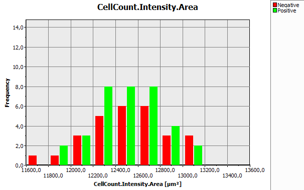
Figure 1110. Data Series graph
Primary/Secondary Tiling tabs
Both define another two groupings enabling the user to see more instances of the same graph populated with different group data. Primary Tiling defines the groups to be displayed in graph tiles horizontally whereas Secondary Tiling defines them to be displayed vertically.
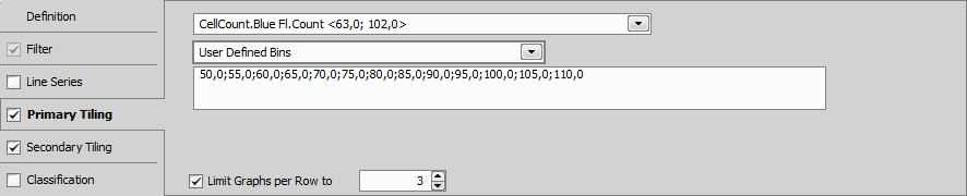
Figure 1111. Primary Tiling tab
Classification
This tab is used to create classes over the resulting graphs. These classes are easily defined by selecting the class color, entering its name and specifying its range (by editing from and to columns or by moving the rhomb symbol directly inside the graph).
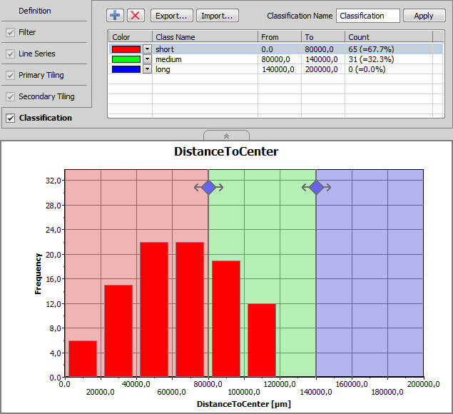
Figure 1112.
Histogram and Scatterplot allow for manual classification. Scatterplot can be classified in two ways:
Select this option from the drop-down menu and give it a Classification Name. Then move the blue diamond directly in the graph (or the central horizontal and vertical line) to define the area of the quarters. Adjust the color and name for each class (Class Name column) and click . A new column with the given name is created under the Custom Metadata column in the results view and the data values correspond to the defined classes.
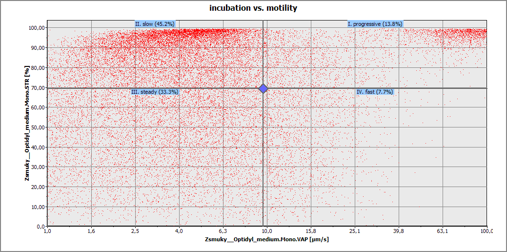
Figure 1113. Four group scatterplot classification based on the VAP and STR features
A gate is a graphical boundary that determines which characteristics of data are suitable for further analysis. Select Gating in the drop-down menu and give it a Classification Name. Click directly in the scatterplot graph to define a polygon representing a boundary for your selected data, then click the secondary-mouse button to confirm the gate. Multiple gates can be added simply by adding a new class ( ). Adjust the color and name for each class (Class Name column) and click . A new column with the given name is created under the Custom Metadata column in the results view and the data values correspond to the defined classes.
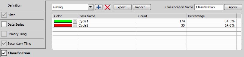
Figure 1114. Two classes, named Cycle1 and Cycle2, set for gating.
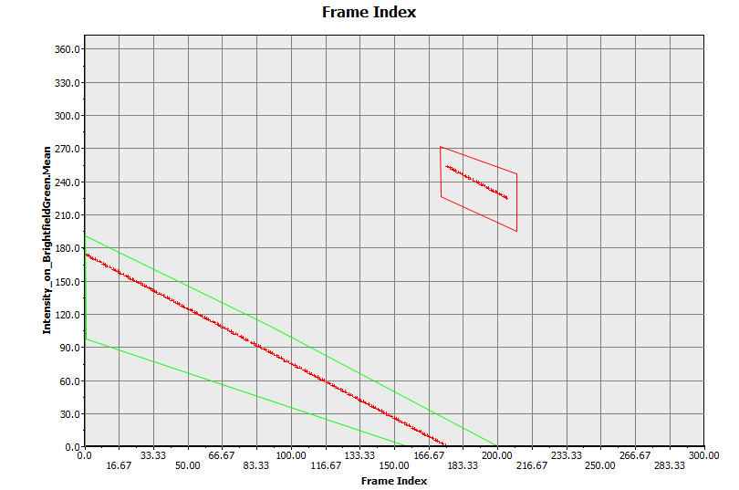
Figure 1115. Two gates drawn directly into the scatterplot..
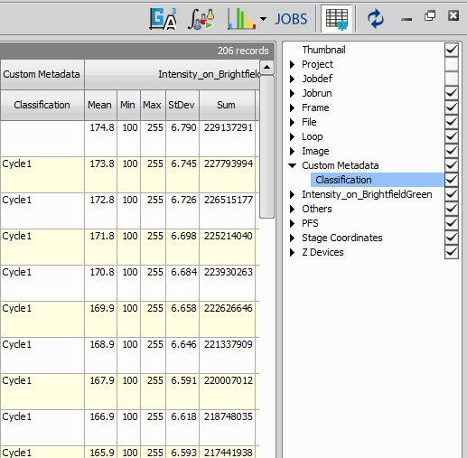
Figure 1116. Resulting table with classes corresponding to the defined gates.
Right-click a job name in the  JOBS Explorer panel to display the following commands:
Runs the selected job definition in normal/wizard mode.
Continues the selected job.
Opens the Job Definition Window containing the selected job.
Opens the Job Results window (see Running a Job, Viewing Results and Graphs).
Runs analysis (Analysis) on the job run results contained in the selected job.
Enables renaming your job definition.
Duplicates the selected job.
Deletes the selected job definition.
Locks your job definition so that it cannot be changed in the Job Definition Window.
Copies the selected job into the selected destination project.
Opens the Run General Analysis 3 on Job dialog window where it is possible to choose an analysis which is executed on the selected job.
Saves the definition of the selected job as a .bin file into the specified folder under a specified filename. Multiple definitions can be selected at once and exported to the specified folder as well.
Can be used to export job results to TIFF.
Copies the full paths to all images from all job runs inside the selected job definition to clipboard. Path to each image is checked so that only the existing paths are copied.
Places the selected job on the Jobs Toolbar as a button.
Right-click a job-run in the JOBS Explorer panel to display the following commands:
Opens the Job Results window (see Running a Job, Viewing Results and Graphs).
Opens the Job Results in a new window.
Runs analysis (Analysis) on the selected job results.
Opens a folder on your hard drive containing your result image data.
Can be used to export job results to TIFF.
Copies the full paths to all images from the selected job runs to clipboard. Job runs can be selected across multiple job definitions (use Ctrl + mouse click). Path to each image is checked so that only the existing paths are copied.
Enables the user to copy/move the selected job runs into a new or already existing job.
Deletes the selected job run.
Opens the Select well plate window where the user can choose a different wellplate for the current jobrun.
Opens the Image > ND Processing > Stitch Multipoint to Large Image dialog window enabling to stitch captured images into a large image. This function works on any Job or HCA with any Point loop if image overlapping exists. Resulting new (and modified) Job runs are put under the same job into a separate group called Stitched Large Images. These stitched images are shown stitched in the Preview area inside the View Job Results window.
Opens the Run General Analysis 3 on Jobrun dialog window where it is possible to choose an analysis which is executed on the selected jobrun.
Performs maximum intensity projection on the selected dimension (Time or Z-stack) of the selected job run(s).
This button imports a previously saved job definition into your current project.
Saves your job as a new Job Definition (see Job Definition Window).
Assigns the job settings of the selected run to its Job Definition. By default the Job Definition uses the settings of the latest run.
Enables assigning short text notes to each of your job runs.