
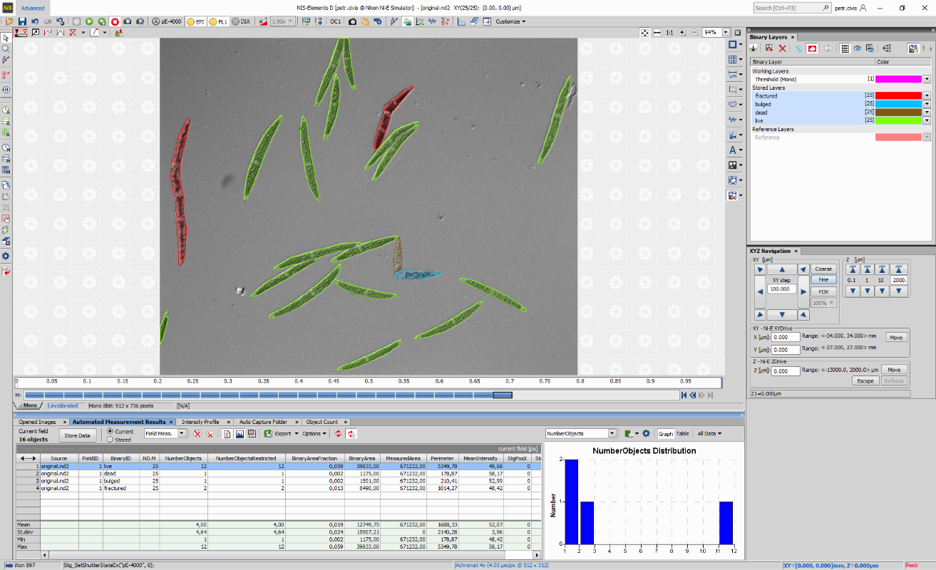
Figure 31. NIS-Elements Advanced Layout
Context menu over the Advanced tab is used for setting the Startup to the current or last layout, loading the original settings of the selected predefined layout (Load Default), lock the selected layout so that its components cannot be moved or closed (Lock Layout), Save Current Layout As a new layout or open the Layout Manager (Modifying Layouts).
All NIS-Elements functions are accessible from the main menu at the top of the screen. Menu commands are grouped according to their purpose.
Concerns operations with the current image. Copy, Paste, Undo, General Options and other commands are available.
Concerns operations with reference images. To display all reference images, use the  View > Thumbnails command.
(requires: Database Module)
Concerns database connections, database tables, database backup, etc.
Concerns opened image windows. It enables the user to select a window to be displayed or select a predefined windows documents layout.
Enables access to additional information about the system such as help, version update, application log, etc.
This search box can be used to quickly find and run a menu function. Type in the name of a function and select it from the list of found results.
 Set color scheme
 Click on this button to change NIS-Elements color scheme. Windows color scheme takes over the settings from MS Windows.
 Organizer
 Switches into the Organizer layout suitable for working with image files and databases. Another way to enter this mode is to run the View > Organizer Layout  command or use the F10 key. For more information please see: Organizer.
 Font Size
There is a default set of toolbars, each toolbar containing number of buttons. There is also one fully customizable toolbar - the main left toolbar - to which any button can be added. Every button or whole toolbar can be hidden by the user. Please see Arranging User Interface for further details.
Left Toolbar
 Pointing Tool
 The main and default tool in NIS-Elements used for clicking on objects and selecting graphical interface elements.
 Magnifier Glass
 Tool for magnifying portions of an image. Select this tool and click and hold the primary mouse button inside your image. Advanced functions with this tool are described here: Handy Keyboard Shortcuts. To define the zooming parameters run View > Magnifier Glass Options (see: View > Magnifier Glass Options).
 Annotate and Measure
 Opens the View > Analysis Controls > Annotations and Measurements  panel.
 Modify Binary
 Opens the View > Analysis Controls > Binary Toolbar panel.
 Define/Run Experiment
 Opens the View > Acquisition Controls > Capture Timelapse panel.
 Capture Timelapse Automatically
 Executes Acquire > Capture Timelapse > Capture Automatically.
 Capture Z-Series Automatically
 Executes Acquire > Capture Z-Series > Capture Automatically.
 Capture Multipoint Automatically
 Executes Acquire > Capture Multipoint > Capture Automatically.
 Capture Timelapse Manually
 Capture Z-Series Manually
 Capture Multipoint Manually
 Copy
Copy Executes Edit > Copy .
 Paste As New Image
 Executes Edit > Paste As New Image .
 Duplicate
 Executes File > Duplicate.
 Crop
Crop Executes Image > Crop .
 Snipping Tool
 Executes Edit > Snipping Tool.
 Run Macro
 Executes Macro > Run .
 Close All
 Executes Window > Close All .
 Options
 Executes Edit > Options .
 Toolbar Setup
 Executes View > Customize Toolbar > Setup.
The status bar at the bottom of the screen displays the following information:

Figure 32. The application status bar
This part of the status bar displays available layouts.
Note
The layout Tabs may be hidden when the Show Layout Tabs option in the Arranging User Interface window is deselected.
This status bar section displays the type of the currently selected camera.
Here you can get information about the most recently performed command. The FPS / Exposure / Focus info is shown in case of live image. The black bar indicates the focus rate. Longer black bar represents more of the image in focus.
This section show the name of the current objective.
Current coordinates of XY (Z) stage are shown in this part of the status bar.
Docking panes are square spaces inside the application window, where you can place (dock) any of the control panels. There is one docking pane available at the Right, Bottom, and Left side of the application screen.
To Display a Docking Pane
Go to the
View > Docking Panes sub-menu and select the pane you would like to display. 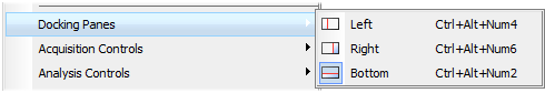
Figure 33.
The docking pane appears, either empty or with some window(s) docked inside.
Repeat this procedure to display more docking panes.
Handling Control Panels
Various control panels can be displayed docked within the docking panes or they can be floating. See the following picture:
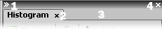
Figure 34. The Docked Control Panel Caption
To handle the control panels (CPs), you can:
Locate the  Show Last Controls button on the main left toolbar. When you click it, the list of recently closed CPs appears. Pick one to display it again.
Right click inside a docking pane (3) to display the context menu. Select the control panel to be displayed. If the window is already opened somewhere else (in another docking pane or floating), it closes and moves to the new destination.
Drag any CP by the tab and drop it somewhere. If you drop it by the edge of a docking pane, it will create another column of this pane. If you drop it over the caption of another CP, it will be docked in the same pane as a new tab. If dropped somewhere else, the CP will be floating.
A color frame appears when you place the mouse cursor dragging a CP over the edge of a docking pane or a caption of another CP. It indicates that if you drop it, its placement will be handled automatically.
Click the arrows in the top left corner. The pane minimizes to a stripe by the edge of the screen. It can be restored to its original position by double clicking this stripe or by clicking the arrows again.
Click the cross button (4) in the docking pane caption. Or you can right click the pane and unselect the Docking View option.
To dock (and undock) a CP, double click its tab.
Another way to display a CP is to go to the View menu and select the desired control panel. After that, the CP appears on the screen - floating or docked. Positions of the windows are being saved by the system so that each control panel appears in the same position as it was before it being hidden. The controls are sorted to several groups.
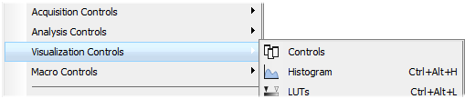
Figure 35.
Tools affecting the appearance of the current image are gathered within the image window toolbars (the top image toolbar and the right image toolbar). There are the following buttons by default:
 Enable LUTs (L)
 Applies LUTs to the image. See LUTs - Non-destructive Image Enhancement.
 Show LUTs window
 Keep Auto Scale LUTs
 Auto Scale
 Reset LUTs
 Pixel Saturation Indication (Ctrl+Shift+S)
 Turns on/off pixel saturation indication without setting on/off LUTs. Select the highlighting color from the nearby pull-down menu for Oversaturated pixels and/or Undersaturated pixels. See Channel Coloring.
 Open Attachment
 Opens a file previously attached and saved with the ND2 file. To attach any file to an image, right-click inside the image, select Add Attachment and choose a file to be attached. Maximum size of the attached file is 64 MB. Context menu over the image also enables the user to Open Attachment... (same functionality as the button), Save Attachment As... (saves the attached file separately) or Remove Attachment (attachment is removed from the ND2 file).
 Enable Dynamic Threshold
 Switch to Main View,
  Show Slices View,
  Show Volume View,
  Show Tiled View,
  Show Maximum Intensity Projection,
  Show Maximum Intensity Projection
 When working with the ND images, these functions become available.
For more information see ND Views.
 Mouse XY
 Requires a motorized stage. If turned on, the mouse cursor on a live image changes and you can control the XY stage by dragging the live image.
 Create Focused Image
 Creates an EDF focused image. See Extended Depth of Focus.
 Create EDF Focused Document
 Creates a new simple focused image from an ND file. See Extended Depth of Focus.
 Show EDF Z-profile
 Opens the EDF Z-profile panel with the Z-profile graph of the image. See View > Analysis Controls > EDF Z-Profile  .
.
 Show EDF Z-map
 Creates a new image displaying the EDF Z-map. Opens the Z-map setting window, where you can choose the Z-map method. Press OK and the new focused image is created. See Applications > EDF > Show Z-Map Image.
 Show EDF 3D Surface View
 Opens the 3D surface view of the image. See Applications > EDF > Show Surface View .
 Show EDF Anaglyph
 Enables/disables Anaglyph 3D view. New options appear in the toolbar - you can define the position of the first frame (Lowest/Highest), Style (the color combination used for anaglyph image), Effect (Descend into the Screen / Rise from the Screen) and Z-zoom (define the percentage).
 Refresh ND View
 Fit to screen
 Best Fit
 Adjusts zoom to fit the image window in one direction and fill the available area with the image.
 1:1 Zoom
 Zoom In
 Zoom Out
 Turn Probe On/Off
 This button activates the probe. The probe affects histograms, auto exposure and auto white balance functions.
 Show Grid
 Show Scale
 Turn Frame On/Off
 Turn ROI On/Off
 Show Profile
 Displays the Measure > Intensity Profile control panel. It allows you to specify a linear section in the image of which the pixel intensities graph will be created.
 View LUT Intensity
 Displays the scale of intensities used inside the image. It works on monochromatic images or a single image channel.
 Show Annotations (A)
 Displays the vector layer which typically consists of annotation objects (text labels, arrows) and measurement objects.
 View Binary
 View Color
 View Overlay
 (requires: Automatic Measurement)
Displays the color layer and the binary layer in overlay.
Tip
Right click the icons to invoke a context menu where properties of each tool can be modified.
Channel Tabs
Channel tabs at the bottom left corner of the image window enable switching between image channels. You can also edit their properties using commands available via a context-menu. See also Image Layers.

Figure 37. Channel tabs of an RGB image
Status Bar
The status bar at the bottom of the image window displays the following information:

Figure 38. Status bar of the image window
The first field of the image window status bar Image displays the calibration. See also Calibration, Units.
Image bit depth (8bit, 12bit, 16bit, etc.) followed by Image size. You can change the displayed units from the context menu.
Pixel coordinates of the mouse cursor along with channel intensities, Binary layer value (0 or 1) and the Color mode (RGB, Monochromatic, etc.).
Having a well organized application layout can help you make the work with NIS-Elements very effective. There are the following options on customizing the appearance of NIS-Elements:
The channel tabs and the layout tabs may be hidden to save some screen-space. Display the Appearance Options window and de-select the Show Channel Tabs and the Show Layout Tabs options.
Image controls and the image status bar may be hidden. Use the Common for all images, auto hide bottom toolbar option of the Appearance Options window.
When an image is displayed in great magnification, scroll bars automatically appear by the sides of the image window. You can hide them by de-selecting the Show Scrollbars context menu option.
All control panels (Camera Settings, Measurement, Histogram, LUTs, etc.) can be arranged inside or outside of the main application window.
The control panels as well as toolbars can be floating or docked on sides of the application screen.
The NIS-Elements window can be stretched to occupy two monitors. When you switch from different application, NIS-Elements will be activated on both monitors.
Toolbar buttons may be added and removed from toolbars. See Modifying Toolbars.
You can hide some of the GUI elements which are displayed by default: