Layout

Customize Toolbar
Acquisition Controls
Analysis Controls
Visualization Controls
Macro Controls
Image
Layers
Layers Properties
Zoom
View/Process Component


Selecting commands from the command history.
Removing redundant commands - decide whether to remove doubled commands or not.
Adding, removing, or editing chosen commands.
Finishing the Paste History wizard.
Click either the Coarse or Fine button which you want to define the step of.
Fill the desired value to the edit box in the middle. The value is set and remembered.
Fill the coordinates of the new position in the edit box(es).
Press the Move button.
 Insert Text
 Insert Arrow
 Insert Labeled Arrow
 Insert Line
 Insert Rectangle
 Insert Ellipse
 Insert Polyline
 Insert Polygon
Click the View > Analysis Controls > EDF Z-Profile
 command to display the control window
Open an ND2 file containing the Z dimension.
Use the Applications > EDF > Create Focused Image
 command.
The graph appears in the control window automatically.
To add more profile lines to the image, use the context menu over a profile line and select Add Z-Profile Line.
To remove an existing line, use the context menu over a profile line and select Remove Z-Profile Line.
To change the appearance of a profile line, use the context menu over the line and select Line Properties....
Intensity
Channels
Hue, Saturation, Intensity
Ratio
In the View > Analysis Controls > Automated Measurement
 panel, click the Update Measurement
  button to measure the current image. For a multi-dimensional image, use the Keep Updating Measurement
  button to make sure that data of the current frame are always displayed.
Right click to the restrictions field to select one or more of the measurement features.
Select the restriction feature you would like to define. Name of the selected feature appears above the table. The current interval of possible values is indicated next to the feature name.
The limit values are indicated next to the feature name in the table, and can be modified directly by double clicking the indicated value. The infinitude can be defined by entering “oo” or “inf”.
Use the histogram and its controls in the bottom part of the control window to directly change the restrictive values. The slider on the side changes proportional height of the histogram. The two independent sliders below the histogram set the lower and upper limit value of the selected measurement feature. The accepted values are marked green. The restricted values are red.
Decide whether the defined interval will be excluded or included from/in results. This is done by setting the Inside/Outside value next to the feature name.
The nearby check box indicates whether the restriction is applied or not. If applied, the histogram below is color, otherwise it is gray.
Press the
 button.
Select a command from the Paste Command window. And press OK.
Selected command is inserted in the Macro Panel window.
Right-click the command and select the Properties command from the context menu. Change appearance properties (used bitmap, font properties, etc.) of the command's button and confirm.
Press the
 button.
The Add Macro window appears.
Select a macro. The Predefined, Shared and Recently used macros are listed in separate sections. When you need to import a macro from file, press the
button and choose proper file. To select multiple macros, use the  button to select them all within a section, or check their individual check-boxes.
When necessary, use the
 command to edit the selected macro in the Macro Editor.
Confirm by pressing the OK button.
Selected macros are inserted in the Macro Panel window.
Right-click the command and select the Properties command from the context menu. Change appearance properties (used bitmap, font properties, etc.) of the command's button and confirm.
Display the cross by the Show Cross button. You can select to display a small or large cross. If the
 Add View to Synchronizer function is turned on in multiple slices views, the cross position is automatically synchronized among them.
Place the section lines anywhere in the image.
Choose different display mode from the menu which appears when you press the Mode button. Slices, maximum and minimum intensity projection view are available.
The YZ and XZ views are available on sides of the common XY view. Any of the view can be hidden/displayed. Deselect the proper button (XY, XZ, YZ) to hide the view.
The XZ/YZ views can be enlarged/reduced by selecting Z-zoom.
Binary, color, overlay layers and ROIs can be displayed using corresponding buttons.
A color scale can be displayed in channel, Ratio, FRET, or Calcium views by a command from the context menu. You can change color of the scale or convert it to a gradient (available for FRET and Ratio views). If 3D binary objects are defined, it is possible to colorize them on the context menu (Colorize Binary by 3D Objects).
Time is rescaled if there are 2 Time phases with different Time Intervals and Time Durations.
EDF Z-profile showing the Z profile line of the current slice can be shown/hidden using a context menu function (Show/Hide EDF Z-Profile).
Manual length measurement in 3D inside the slices view can be performed using
 Length 3D from the menu View > Analysis Controls > Annotations and Measurements
  . See also 3D describing details about the 3D length measurement. (requires: EDF Module)
 Rectangular Grid
 Circle
 Simple Circle
 Cross
Cross Industrial Cross
 Simple Cross
- Vertical Ruler
 Horizontal Ruler
 Graticule Mask
Font type
Size
Alignment
Vertical Alignment
Style (Bold, Italic, Underlined)
Mean - mean intensity of the stripe width is displayed in the graph
Max - maximum intensity of the stripe width is displayed in the graph

This command switches NIS-Elements application to Organizer Layout (See Organizer).
(requires: Automatic Measurement)
The Thumbnails command displays all working images (reference, current, images for undo...) at reduced size.
NIS-Elements can store temporarily a number of reference images to memory. They can be recalled later, or image arithmetic operations can be performed combining the current and the reference images. All the related commands can be found within the Reference menu.
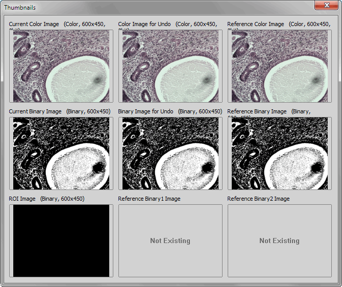
Figure 554.
Displayed Thumbnails
The currently active image.
The last image saved automatically to the Undo History.
The reference image added by user via the the Reference menu. See Reference > Current Image -> Reference.
The currently active binary image.
The last binary image saved automatically to the Undo History.
Commands from within the Reference menu were used to copy binary images to these positions. However, this functionality has been replaced by advanced commands which work with multiple binary layers. See Binary > Binary Operations, View > Analysis Controls > Binary Layers  .
.
The current color and binary image can be copied into the Reference and Measurement ROI positions using the commands from the Reference menu. The Current and for Undo images are obtained automatically.
This command saves changes of the current layout.
See Also
Arranging User Interface
This command saves the current NIS-Elements layout under a different name. The following dialog box appears:
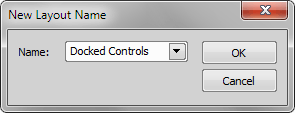
Figure 555.
Type the new name in or select one that is already in use and confirm it by .
See Also
Arranging User Interface
This command saves current layout and sets it as default.
This command reloads the current layout settings. It discards changes made from the time it was last saved.
See Also
Arranging User Interface
This command opens the Layout Manager - a NIS-Elements layout administration tool. Please see the User Interface chapter for more details.
Configures a toolbar.
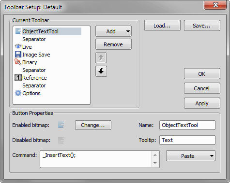
Figure 556.
Displays list of icons (command) in current toolbar.
Adds a new toolbar command or a separator.
Removes currently selected command.
Changes the order of icons on the toolbar.
Displays icons in enabled and disabled state together with associated command.
Press this button to change the image associated to command.
Write command name (or name of more command), that should be associated to current toolbar button.
This submenu helps to insert commands into the command edit box. Choose whether to:
Opens the list of all available commands. Choose the one you would like to insert.
Opens the Macro - Open dialog box in order to define a macro to be executed.
Pastes the sequence of recently used commands in four steps:
Displays name of current toolbar entry.
Displays tooltip, that will be displayed when you move over the toolbar button by mouse.
See Also
View > Customize Toolbar > Next, View > Customize Toolbar > Previous
 , Right
  , Bottom
These commands display/hide the selected docking pane. A docking pane enables you to group control panels (e.g. Histogram, LUTs, Camera Settings, etc.) to one side of the screen.
See also Docking Panes.

Acquisition
This panel shows basic acquisition tools (View > Acquisition Controls > Acquisition ).
 Live
Live Displays the live camera image according to the camera settings (the button changes to Freeze when the live image is shown).
Capture Acquires a single image from the camera.
 Large Image
 Opens the Scanning Wizard (Addons > Large Images > Scanning Wizard  ) used for a step by step large image acquisition.
 Save
Save Saves the current image.
 Save As...
 Opens a standard save as... dialog for saving image files.
 Open
Open Displays a standard opening dialog for opening image files.
Light Paths
Shows available light paths (light tracks between the cameras and illumination devices) present in the current configuration.
 Light Path
 Click this button to open the  Lightpath Scheme
  setting up the light paths.
 Add
Add Opens the Calibration > New Optical Configuration  dialog enabling to create a new optical configuration.
Cameras and Devices
Displays all cameras and devices included in the current light path. All camera and device controls are described in their particular section.
Opens the AOTF Pad. Please see AOTF via NIDAQ - Illumination Device.

This control window displays the content of the Auto Capture Folder. This folder is used by the File > Open/Save Next > Save Next  and Acquire > Auto Capture
  commands to store images.
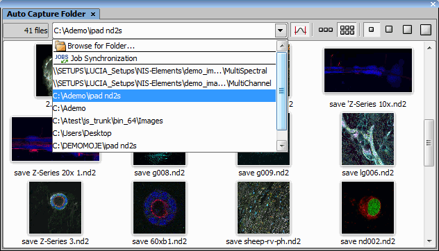
Figure 557. Auto Capture Folder dialog window
 Browse for Folder...
 The destination directory can be changed by clicking the Select Directory button in the combo box and search for a new folder. The setting is global for the File > Open/Save Next > Save Next and the Acquire > Auto Capture commands. List of recently used folders is displayed below the Browse for Folder... and  Job Synchronization items.
Job Synchronization This virtual folder automatically shows the images acquired by the last launched job.
Number of images in the folder is indicated in the top left corner of the control window.

 wrapping,


 thumbnail size
 Image thumbnails can be lined up in a single row or in multiple rows using the wrapping buttons. Number of rows depends on the selected thumbnail size and on the size of the control window. Size of image thumbnails can be easily changed using the thumbnail size buttons.
 Apply autocontrast to thumbnails
 Press this button to apply LUTs autocontrast function to the displayed thumbnails.
Caution
Using this function, two almost-identical images may look different (brightness-wise). For example if the same scene is captured with and without a scale, the scale may cause the thumbnails to look differently.

This control window contains tools used for creating an AVI movie. Creating movies is an efficient way how to present your image data outside the NIS-Elements application.
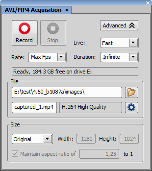
Figure 558.
See Capturing AVI Movie for more information.

This commands adjusts parameters of the currently used camera. The Camera Settings control window appears.

This control panel contains a single button which captures an image and saves it to a folder according to the settings:
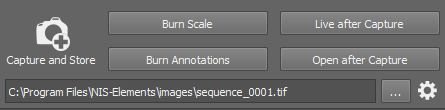
Figure 559.
Press the ... button and select the folder where images captured by the  Capture and Store button will be saved. The path and file name of the next image to be saved is displayed on the left.
Select which vector layers will be burned into the saved images. We recommend to use these options only if saving the captured images to a file format which is not capable of saving vector layers (bmp, png, ...). See also Supported File Formats. Note that mono images are automatically converted to RGB images after the scale/annotation is burned. Image data and quantitative information can be lost.
Displays live image after the Capture and Store button is clicked.
Select this option to open each captured image in NIS-Elements.
Capture and Store Click this option and a new image will be captured and saved to the directory specified above.
 Settings
 Type the prefix and numbering style intended for the files being saved automatically. The Next File field informs you and enables you to change the number which will be used for the next image saved automatically.
Select the file format to save the images in. Some formats enable you to set the Compression parameter. It is recommended to use either “none” or “lossless” in order to preserve good image quality.
The images can be sorted to subdirectories automatically based on the time of acquisition. Select this option and use place-holders to specify format of the folder names (click  to display a list of available place-holders). E.g.: “$YYYY$MM$DD” would create a new subdirectory for each day named like this: “20170103”.

This window enables you to set-up and run a time-lapse acquisition. Please see Time-lapse Acquisition.

Performs manual user acquisition based on single captured images of an experiment. Press the Capture button to capture each frame. An ND2 file is created from the sequence of captured images after you press the Finish button.
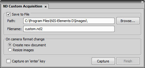
Figure 560.
Check this item to save the image in a file. Specify the destination folder and name the file.
This option defines an action which should be done when camera format (resolution) has changed during the experiment. There are two possibilities: either a new image is created or the image is resized.
Check this option to assign the Enter key to the Capture action.

Opens the Nosepiece pad of the manual microscope (see Nikon MM 400/800 Microscopes).

This control window provides an overview of filters, shutters, and laser switchers within the system. The devices can be operated from this window.
Shutters
All available shutters are listed on the device toolbar (part of the top application toolbar).
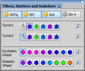
Figure 561.
You can open / close an operating shutter by clicking on its icon. When you right click the shutter button, a contextual menu containing the Shutter Parameters command appears. Click the command to display the following window:
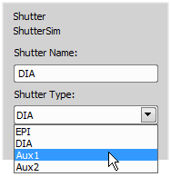
Figure 562.
Define a new name for the shutter and select the proper type of the shutter (EPI, DIA, Aux1, Aux2). You can display this window also from the Device Manager or Microscope Pad.
Filters
Press the button which corresponds to the filter you want to use. A filter settings can be changed after you press the  button in a Filters Block Settings window:
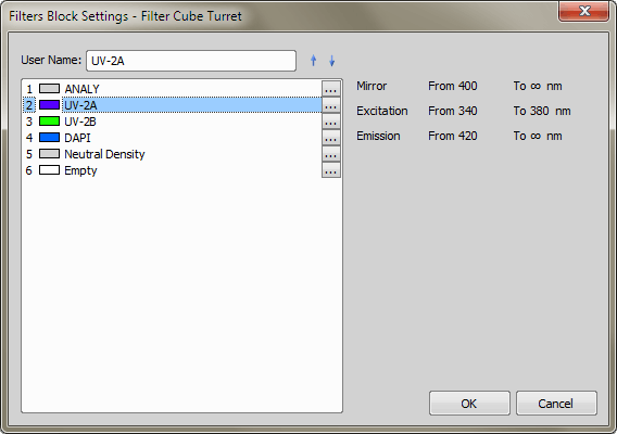
Figure 563.
All filters present in selected filter turret are listed in this window. Available filter information as Excitation, Mirror and Emission wavelengths are displayed in the right part of the window. You can select a different filter from a Filter Blocks Database which appears when you press the ... button in the Filters Block Setting dialog window:
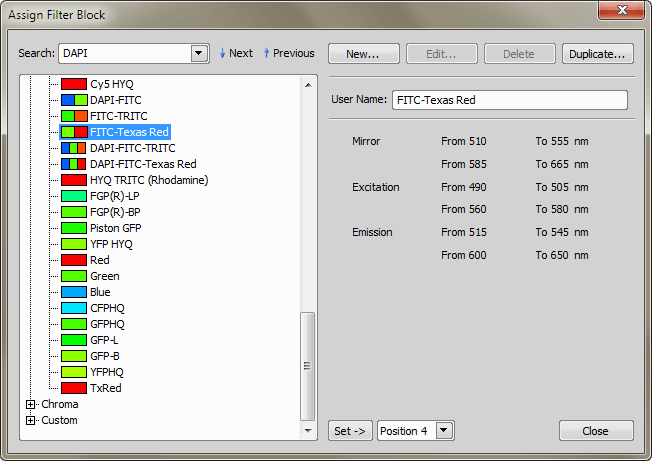
Figure 564.
Use commands in this window to manage filters. Filters in the Nikon and Chroma thread are predefined filters and can not be edited. Custom filters are defined by the user and are editable. Select a filter from the database. Enter the name to the Search box and press the  Next or
  Previous button. Information about currently selected filter are displayed on the right side of the window. You can also add a New custom filter, Edit existing custom filter, Delete it or Duplicate it. Press the Set button to assign selected filter to the selected turret position.
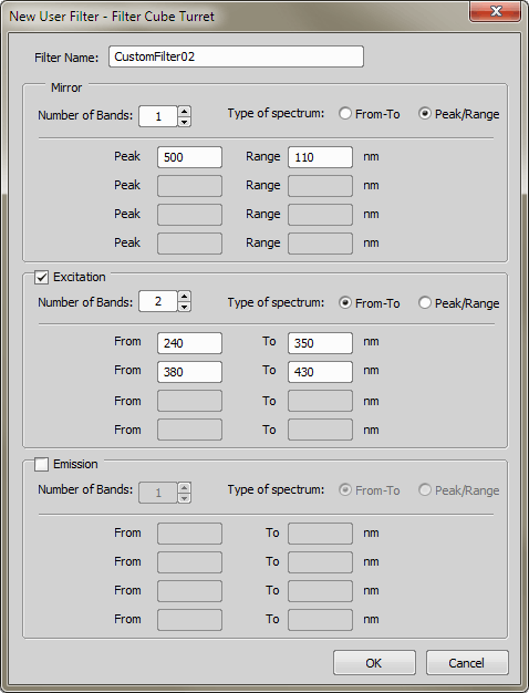
Figure 565. New/Edit custom filter
Displays editable filter name.
Check which settings is used for defined filter.
Specify number of used bands.
The spectrum can be defined by setting the from-to wavelength values, or by setting the peak value and the range of wavelengths. The number of text boxes depends on number of bands used.

(requires: Stage Incubator)
This command displays a control pad of the connected incubator. Depending on the particular model/manufacturer, the pad can be used to set target values (heat/gas concentration/humidity) and to view the current values.
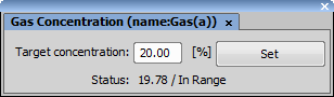
Figure 566.
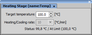
Figure 567.

(requires: Well Plate Loader)
Opens the Well Plate loader control window.

This control window manages and overviews optical configurations defined and used by the application.
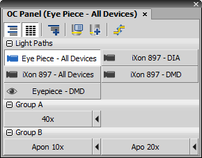
Figure 568.
Control Window Options
 Show Groups
 Press this button to sort the optical configurations displayed in the control window to groups. These groups can be expanded or collapsed by the +/- buttons next to the group name.
 Regular buttons
 After you press this button, all optical configurations button stretch to the same size.
 New Group
 Press this button to create a new group of optical configurations.
 Explore Optical Configurations
 Opens the Optical Configurations window. See Calibration > Optical Configurations for further description.
New Optical Configuration Opens the New Optical Configuration window. See Calibration > New Optical Configuration for further description.
Lightpath Scheme Opens the Lightpath Scheme pad showing the current microscope configuration with visible light paths.
These buttons represent available optical configurations which are placed on the Optical Configuration toolbar. Press the corresponding button to select/unselect an optical configuration. Channel color for optical configuration is displayed next to each of the buttons. If you press the black arrow button, current camera and device settings will be assigned to the selected optical configuration.
Context Menu over Toolbar and Groups
Creates a new OC group with a given name.
Renames the group over which the user is inducing the menu.
Regular buttons can be turned on/off using this command.
Groups can be shown/hidden using this command.
Color next to each channel can be shown/hidden using this command.
Displays/hides the black arrow next to each OC button, used for assigning the current settings.
This command shows/hides the main toolbar containing control buttons.
This command can be used to lock the current size of the window. The window cannot be resized until the geometry is unlocked again.
All OC buttons can be shown in the main toolbar using this command.
Opens the Properties dialog where the font type, font size, font style, and text and background colors of the OC buttons can be changed for the current group.
Context Menu over OC buttons
Assigns the current objective to the selected OC.
Assigns the current camera setting to the selected OC.
Assigns the current microscope setting to the selected OC.
Opens the Properties dialog window enabling to adjust the type, size, style and color of the font including the background color of the selected OC button.
Reveals a context menu described above.
Calibrates the selected OC using the current objective.
Selects/deselects the OC button.
Copies the settings of the current OC to the OC chosen from the context menu.
Copies the selected OC into a new OC with a given name.
Opens the New Optical Configuration dialog window enabling to define a new OC which is then added to the OC Panel.
Removes the selected OC from the OC Panel.
Renames the selected OC.
Opens the Optical Configurations dialog window enabling to edit the selected OC.

Opens the Piezo XY Pad used for controlling the piezo XY stage. Adjust the X/Y sliders to move the stage in the particular axis direction or set the value in the edit box and click . The  button returns the stage to its home position.

Displays the Real Time EDF control panel. See Real Time EDF.

Please see Shading Correction.

(requires: Slide Loader)
This command opens the Slide Loader control window.
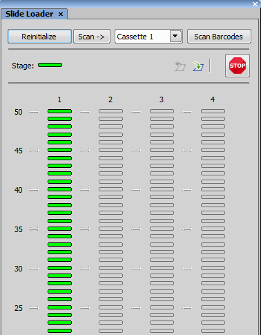
Figure 569.
This button initializes the slide loader and retrieves information about slides and cassettes present in the device.
Starts scanning of slides of all cassettes present in the loader.
Scans bar codes of all slides.
Indicates the current stage state (empty or loaded).
Removes the slide currently loaded on the microscope stage and returns it to its original position.
If some unexpected event occurs or a crash is at hand, press this button to stop the slide loader immediately.

Displays the control pad or the control full pad of the connected microscope.

Opens the Two Cameras panel which can run the live signal and capture images on two cameras connected to a single port through a Dual Camera splitter. The highlighted camera name indicates the active camera which can be controlled in the NIS-Elements top toolbar. Active camera can be changed by clicking on its name.
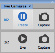
Figure 570.

(requires: Stage)
If a motorized stage and / or a Z drive is present in the system, their positioning can be controlled using this panel.
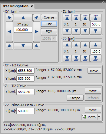
Figure 571.
Relative Movements
Two accuracy settings of movement can be set to Coarse or Fine. Whenever an arrow button is clicked, the stage moves by one step in the selected direction. Moving the stage in a diagonal direction, e.g. top-right direction, behaves like if the top and right moves are performed together. The current step size is displayed between the arrow buttons.
Note
Each physical device has its minimum step size. If the step value set in the edit box is smaller than this minimum, the device will move by the minimum achievable step without warning.
If you pressed the FOV button, the step size is calculated automatically in order to match the current camera field of view. The below pull-down menu reduces the calculated step size by the given percentage.
Click the arrow to move the Z drive in the indicated direction with the predefined or custom step size. The arrow button with a sample ( ) indicates the Z drive direction moving towards the sample.
Note
Some stages require Z calibration before Z navigation can be used. If your Z control is disabled (N/A), calibrate the stage using Devices > Calibrate Z.
Absolute Movements
You can move the stage(s) to any position by giving the system its absolute coordinates.
Moves Z drive to its escape position.
Moves Z drive to the previously set refocused position.
Available only when Piezo Z drive device is connected. Press the arrow button to open a submenu and select an action. This action is performed when you press the Piezo button. The Keeps Z position and centers Piezo Z option moves Piezo Z drive to the home position, but keeps the original position of absolute Z (sum of Z1 and Z2). The Move Piezo Z to Home position moves Piezo Z drive to the home position, regardless of Z drive position.

(requires: Stage)
Displays the the XYZ Overview panel:
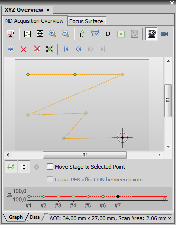
Figure 572.
The window consists of the tabs, each one designed for a different use:
Provides overview of the whole stage with the defined experimental points. It enables the user to modify, add and remove points, which are to be captured during the experiment.
Overview Elements
Selected point is black. All other unselected points are green.
A line marks path of the stage between two points.
A cross represents current position of the stage.
Position of Area of Interest can be changed by pointing mouse cursor over the Area of Interest. Hold down the Ctrl key and the mouse cursor changes its shape to arrows with brown square. Now move the area to a different location. Edit borders of the area to change size or shape of Area of Interest. The status bar on the bottom of the window displays size if the Area of Interest.
Provides overview of the surface used for focusing. It modifies, adds and removes the points, in which the system will refocus. Move the stage to at least 3 different XY positions, focus, and press the  Add Point button each time. The points will determine a plane on which the system will always focus (anywhere on the specimen).
All points used in the focus surface can be redefined using autofocus. Being on the Focus Surface Tab, right-click the (xy) preview and select Auto Focus All Points. Auto focus will be performed and the Z positions modified.
Each tab contains: two upper toolbars with control buttons, an overview area (which can be either graph or data table, depending on which tab is selected in the bottom part of the window), bottom toolbar with controls and arbitrarily Z profile graph area.
Common Controls
 Switch to Area of Interest
 Press this button to hide the whole stage area and display only the Area of Interest.
 Adjust to Points
 Press this button to adjust view so all the points are displayed optimally.
 Full size
 Displays the whole stage overview in full range of the view.
 Zoom In
 Increases magnification of the view.
 Zoom Out
 Decreases magnification of the view.
 Show Point Indexes
 Press this button to display indexes of each point in the overview.
 Show Scale
 Press this button to display scale in the overview.
 Show Point to Point Distance
 Displays real distance between points in the overview.
Add Point Adds a point at the current position of the stage. You can also use the space bar to add a point.
 Remove Point
 Removes selected point.
 Remove All Points
 Removes all points.
 On Double Click Select Nearest Point
 Double-clicking inside the XYZ Overview area moves the stage. If the button is pressed and you double click near the position where an experimental point is placed, the stage will move precisely to the coordinates defined in the experiment.
 Go to First Point
 Moves stage to the first set position.
Note
These commands move the stage to the set position if the Move Stage to Selected Point option is checked. Else the move is done only in the overview window.
 Go to Previous Point
 Moves stage to the previous set position.
 Go to Next Point
 Moves stage to the next set position.
 Go to Last Point
 Moves stage to the last set position.
 Z Auto Scale
 Automatically sets scale of the Z axis to provide the best view of the Z profile graph.
 Show Focus Surface
 Use this button to display Z coordinates of the focus plane in the Z profile graph.
Check this option to make the stage move to the selected point.
Special Controls - ND Acquisition Overview Tab
 Show Scan Areas
 Use this button to display scan areas. It displays area which matches to single captured image over corresponding point. This area depends on selected Objective or Calibration. If a scan area of one point overlaps some scan areas of different points, or scan area of current stage position (marked with a cross) - the color of those areas is red. If they do not overlap, then it is green.
 Show Focus Surface
 If the focus surface is defined, this button displays its color heat-map. The colors indicate whether the focus surface is tilted or curved. A perfectly horizontal focus surface would be displayed as a solid color.
 Front View
 Real position of the sample on the stage is shown in the overview (as seen when standing in front of the microscope).
 Camera View
 Stage overview displays the sample in orientation as it is shown in the live view. Rotation settings in Acquire > Camera Light Path are taken into account.
 Show Z profile
 Displays the Z profile graph in the bottom part of the window.
Check this item to keep PFS on while moving between the points.
Special Controls - Focus Surface and PFS Surface tab
 Redefine Z Position
 Overwrites the currently selected point in the Focus Surface tab with the current Z position of the stage.
 Reload
 Each time NIS-Elements application is restarted, the focus surface points are cleared. If you want to use the points from the last session click on this button to reload the points.
Choose the method used for point interpolation. Smooth and Nearest Neighbor methods are available.
If checked, the stage is moved to appropriate coordinates after a point is created.
 Remove All Points
 Deletes all PFS surface points.
Manual measurement and annotating of images can be performed using the View > Analysis Controls > Annotations and Measurements control window. All kinds of measurement and annotation tools are grouped in this window:
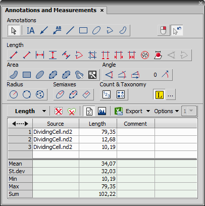
Figure 573.
This toolbar enables you to insert vector objects to the image. The image itself is not affected by the content of the annotation layer, although annotations can be saved with it (JP2, TIFF, and ND2 formats can handle it). After inserting the selected object into the image you can select it using the  Pointing Tool and right-click to edit its Properties.
 Confirm with R-Click
 If this button is active, each drawn annotation or measurement object has to be confirmed by the secondary mouse click. This is especially useful for adjusting the object's shape and precise placing.
 Switch to Pointing tool after drawing new object
 If turned on, the cursor is automatically switched to the Pointing Tool after drawing an annotation or measurement object.
See the description of all available measurement tools in the Measurement Tools section.
 Appending Labels
 Text labels are automatically appended to every new measurement object if this button is turned on. Click the adjacent button to adjust visual properties of the label. The label format can be adjusted in the Manual Measurement section of the Measure > Options window.
Press the Options button to display additional commands:
Choose this command to display Measure > Options dialog window.
Loads the previously saved measured data and configuration of their display from an external file.
Saves the measured data and configuration of their display to an external file.
Selects a class number from the combo box next to which is written into the Comment column of the results table. Use this feature e.g. with the  Count tool to count cells (Class 1) and their nuclei (Class 2).
Defines the number of classes. Insert a numeric value.
The measured values are being appended to the results table. There is one table for each measurement type. The measured data can be exported to an external file via the standard Export menu (see the Exporting Results chapter for further details).
Reset Data Pressing this button will erase the currently displayed data, while the data from different types of measurement will not be affected.
 Clear Screen
 Removes all measurement objects from the image while the measurement data remain in the results table.
 Statistics
 Click this button to display an additional table where overall statistics (Mean, Standard Deviation, Minimum, Maximum, Sum) of the measured values are displayed.
 Histogram
 Optionally, histogram of the data inside the results table can be displayed by selecting the Show Histogram button.
Measurement results of the currently measured quantity is displayed in the table. Switching between measurement tools of different quantities automatically changes the table contents.
Note
The data remains in the table even after the application is restarted. The data will be erased only after the computer restart.
Contextual Menu Commands
Secondary mouse click in the results table reveals a context menu containing the following commands:
If you have clicked on the Source column, this command enables you to display/hide a full path to the measured image file.
These commands enables you to display any combination of columns that is available for the particular measurement type.
Selecting this command adjusts the column width according to the values it contains.
These commands enable you to adjust the current records selection (made using Ctrl/Shift + mouse) and delete the selected records.
Enables you to select the column to sort the records by, and to remove sorting.
The measurement feature selected in this submenu is displayed in the histogram.
Select units and precision for the display of figures.
 Options
 The Options button displays a window with options regarding the histogram appearance. Apart from common appearance settings like color, line width, or default text descriptions of the histogram items there are the following options in the window:
In the Mode pull-down menu, you can select the way of displaying the Y axis (number, number in %, cumulative, cumulative in %).
The histogram can be switched to be displayed as a continuous line instead of a number of bars.
Choose a font and its size to be used for describing x and y axes of the histogram. Write your caption of the particular axis into the Caption edit box below.
Select a font and its size to be used when displaying numeral values inside the histogram.
Select the Bins tab in order to adjust the way bins of the histogram are created. If the histogram bins shall be equidistant, bin width, minimum and maximum values can be set. If non-equidistant, each bin limit values should be put inside the definition table.
You can switch between the graph and the table view via these buttons. The histogram source data are displayed in the table view.
(requires: Automatic Measurement)
The Automated Measurement control window gathers tools needed for fully automated image measurement. The tools can be also displayed as separate panels:
A simple set of tools for binary layers editing. See View > Analysis Controls > Binary Toolbar  .
.
The most common tool for creating a binary layer. See Thresholding.
A tool for classifying pixels. Since it generates a set of binary layers as well as the Thresholding tool does, both these tools are mutually exclusive (only one of them can be selected). See View > Analysis Controls > Pixel Classifier  .
.
For managing of binary layers in the image. See View > Analysis Controls > Binary Layers .
Restrictions applied to the measured binary layers. The purpose of this tool is to exclude the objects which do not match the given criteria from measurement. See View > Analysis Controls > Restrictions 
See also Automated Measurement.

(requires: Automatic Measurement)
Measured data are displayed within this control window.
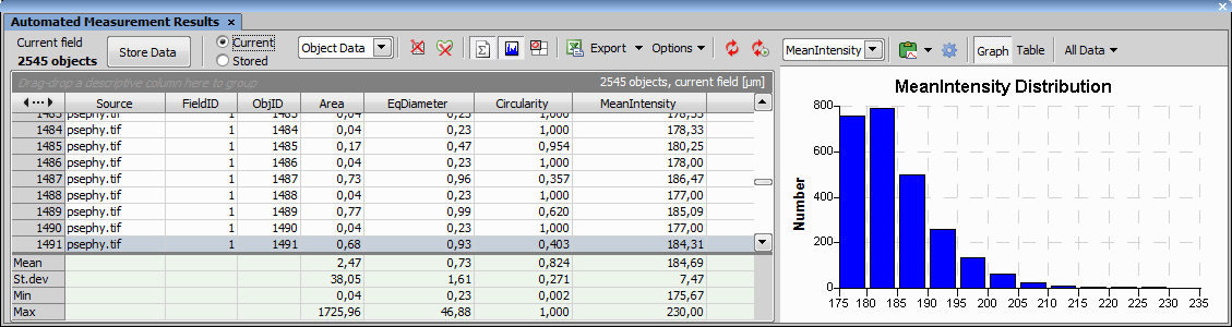
Figure 574.
Use the following tools to handle the measured data:
This information displays the number of objects in current field.
This button moves the Current data to the Stored repository.
You can select which data repository appear in the table. The Current data are the currently measured data which can be yet modified by changing parameters in the Automated Measurement control window followed by clicking the Update Measurement button. The Stored data cannot be changed. Current data are appended to this repository each time the Store Data button is pressed, or if the Measure > Perform Measurement command is run.
This pull-down menu selects the type of measured data. The selected method updates the entire table and the Graph (histogram) area.
Each row of the table represents object features for a single object.
Table data show mean feature values calculated from all objects present in the selected frame and the selected binary layer.
Lists one field (frame) per table row containing the selected field features.
Lists one ROI per table row each containing statistics of all objects (from all binary layers) inside/touching the particular ROI.
Lists one ROI and binary layer per table row each containing statistics of all objects (from a given binary layer) inside/touching the particular ROI.
Reset Data This button clears all data.
Clear Current Measurement Press this button to clear the current measurement.
Show Statistics Press this button to show the statistics.
Show Histogram Press this button to show the histogram.
 Time Series Graph
 Press this button to display the Time Series Graph.
 Show Object Catalog
 Press this button to display the View > Analysis Controls > Object Catalog window.
Exports the measured data to various locations. See Exporting Results for more information.
Press the Options button to display additional commands:
Choose which features are measured. See Measurement Features. You can also select the Comment feature which enables user to insert arbitrary comments to measured items in the data area. The length of the comment is limited by 63 characters.
Note
Automatic updating features update the whole result table. If the Keep Updating or the Update Measurement feature is used, the content of the Comment column will be removed automatically.
Choose which features are measured. See Measurement Features. You can select the Comment feature, too (see above).
Choose this command to display Measure > Options dialog window.
Loads the previously saved measured data and configuration of their display from an external file.
Saves the measured data and configuration of their display to an external file.
Caution
This command does not save the Current data. To make sure, all data will be saved to a file, click the button beforehand.
Update Measurement Press this button to update the current data. Once measurement has been performed, its parameters can be still modified within the View > Analysis Controls > Automated Measurement panel. This button must be pressed in order for the changes to take effect on the data.
Keep Updating Press this button to keep the data continuously updated.
Data Area
You can arrange the view of images efficiently by grouping them. You can group images according to any feature, or comment. Drag the column name bar to the grouping bar (right above the column name bars). All files with matching field values of the selected column will be grouped together. This can be undone by dragging the column caption back to the others. See Figure 153, “Organizer layout” (the Dimensions column is grouped).
The features are gathered in columns. Click the column caption to sort the data ascending or descending.
The right portion of the window contains data analysis and visualization tools. You can display the histogram of the values or a statistics by pressing the adjacent button. Choose the measurement feature from the pull down menu and its distribution is displayed in the histogram. The data are processed. You can export them to a report, MS Excel application or clipboard. Histogram properties can be changed via the Options button (see: Options). If you have grouped the data, you can also display the histogram of a subgroup. The group can be selected from the Groups menu.
Contextual Menu Commands
Opens a window with a list of measurement features. Select which features you want to measure and press the Add button.
Hides the column you are currently pointing at. To make the column visible again, select it in the Show Column pull down list.
Orders columns by default.
Removes selected entry.
Marks selected entry as invalid data.
Purges records marked as invalid.
Enables the user to select or invert selection of the data.
The data can be sorted according to selected column title in descending or ascending order.
Select a feature you want to inspect in more detail. A histogram (or statistics) of the feature values appears in the right portion of the control window.
Displays the list of all possible units. Select the unit you want to use.
Select the precision of the digits.
(requires: Automatic Measurement)
Number of binary layers can be present. A new binary layer can be created for example in the Binary > Binary Editor. Manage the binary layers using the View > Analysis Controls > Binary Layers control window:
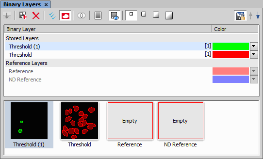
Figure 575. Binary Layers tab
 Store Selected Working Layers
 Moves the selected Working Layers to Stored Layers
 Duplicate Selected Layers
 Duplicates selected binary layers.
Remove Selected Layers Removes selected binary layers.
 Select All Layers
 Marks all working and stored layers in the list.
 Show Reference Layers
 Displays/hides reference layers in the list.
 Binary Operations Dialog
 Opens the Binary Operation dialog window.
 Show Layer List
 Displays a list of binary layers. Maximally 9 items are displayed.
 Show Thumbnails
 Displays a list of binary layers thumbnails. Maximally 10 thumbnails are displayed.
 Show List and Thumbnails
 Displays both lists - list of binary layers and thumbnails.
 Connect objects to 3D
 Creates 3D objects for selected binary layers.
 Fill missing binary frames
 Copies binary layer from the current frame to all frames where binary layer is missing. Apply this function on currently opened ND document if it contains more than one frame and the binary layers are not defined for all frames.
Thumbnail size Sets size (small, medium, big, extra big) of displayed thumbnails.
Contextual Menu Commands
When you right click a thumbnail or binary layer name, a contextual menu appears with additional commands:
This command selects all binary layers.
This command copies selected binary layer to clipboard.
This command pastes copied binary layer.
Name of currently active binary layer is displayed.
This command removes selected binary layer.
This command renames selected binary layer.
This command duplicates selected binary layer.
This command clears selected binary layer from document.
Color of the binary layer can be changed from this color pull down menu.
Uses a smart algorithm to prevent neighboring objects to have similar color.
Colorizes objects by 12 different colors in the direction from the top left corner to the bottom right corner.
It is possible to colorize objects according to a measured value.
This command opens list of components to which the selected binary layer can be attached.
This command detaches selected binary layer from the component back to all components of the document.
(requires: Automatic Measurement)
The most frequently utilized binary tools are grouped in the Binary Toolbar control window. Run the View > Analysis Controls > Binary Toolbar command to display it. It contains the following tools:
Pointing tool This tool turns the mouse cursor to a pointing tool.
 Auto Detect
 Click in the middle of an object and the system will try to detect its borders and highlight them. The algorithm is based on changes of intensity values. The object size can be adjusted by mouse wheel or by the UP/DOWN keys. Finish the detection by right click.
 Auto Detect All
 Click in the middle of an object and drag the mouse to its borders. The system tries to detect the object borders as well as find all the other similar objects. Finish the detection by releasing the mouse button.
 Draw Object
 Draw a binary objects by hand. You can either draw it like polygon or use the “freehand” method while holding the primary mouse button pressed.
 Delete Object
 Click inside a binary object which you would like to delete.
 Separate Objects Manually
 Press the primary mouse button and drag it between two connected objects in order to separate them with this tool.
The following tools perform basic morphology operations. Please refer to the Mathematical Morphology Basics chapter for further details. The Reset Binary tool erases the current binary layer.
 Dilate
  Erode
Erode  Close
Close  Open
Open  Separate Objects Automatically
  Clean Fill Holes
  Clear
Clear Erases all binary objects

Distance Measurement panel provides a full set of measurement tools arranged into six main groups (tabs). Each tab holds the results for each measurement group.
Figure 576. Distance Measurement panel
The table below the measurement tools shows the measurement results and statistics based on the settings of the tools on the right side of the panel. Context menu over a table header enables the user to select which label is shown in the image next to the measurement (Show Source on Label) and to set the Columns Visibility (see below). Context menu over the results data enables the user to Deselect All Rows, Remove Selected Rows, Resize Columns to Contents, Resize Columns to Defaults and Resize Columns Relatively.
Common Tools
 Pointing Tool
 Basic tool for selecting objects in the image.
 Results by Reference
 If this button is pushed, only the results linked to the selected reference object are shown. If the button is not pushed, all reference measurements linked to all reference objects are shown.
These drop-down menus are used to change the color and size of the measurement objects, reference objects and dimension lines. In the References and Stars tab, points of interest can be further specified.
Confirm on Right Click Confirms the drawing of a measurement object by the secondary mouse click.
Switch to Pointing Tool After Drawing Automatically switches to the pointing tool after drawing a measurement object.
Show/Hide Statistics Shows/hides the statistics area at the bottom of the measurement table.
Show/Hide Labels Shows/hides the measurement labels.
 Columns Visibility...
 Opens the Columns Visibility dialog where it is possible to select which measurement features are shown as columns. The same dialog can be opened from the context menu over the results header.
 Show Results from All Documents/Show Results from the Current Document
 Displays the measurement results either from all images or just the current image.
Delete Measurement Deletes all measurements from the currently selected tab.
Delete All Measurements Deletes all measurements from all the measurement tabs.
 Export to Excel
 Drop-down menu next to this button selects whether to export the measurement data and statistics to Excel, to a File or to Clipboard and whether all measurement tabs are exported as separate excel tabs (All Tabs) or just All Visible Columns are exported. Once the selection from the drop-down menu is made, click this button to perform the actual export.
Defines the measurement units.
General
 2 Points
 Draws a line defined by two points (shown as crosses).
 Simple Line
 Draws a simple line.
Vertical Lines Draws two parallel vertical lines.
 Horizontal Lines
 Draws two parallel horizontal lines.
 Free Parallel Lines
 Draws two parallel lines with a free rotation. Draw the first line, confirm it by a secondary mouse click and repeat this procedure for the second line.
 Crosses
 Draws a line defined by two points which are highlighted by crosses over the whole image.
 3 Points Arc
 Draws an arc by clicking 3 points on it. The second point defines the direction and the third point defines the diameter dynamically during its placing.
 3 Points Circle
 Draws a circle by clicking 3 points on it.
 Circle
 Draws a circle by clicking and dragging.
 Autodetect Circle
 Automatically detects a circle with its center in the center of gravity of the clicked object (confirm its detection by the secondary mouse click). The circle has the same area as the detected object.
 2 Points with XYZ Stage
 This function is used for measuring the distance between two points going outside the field of view. Run the live image, click a point in the image, move your stage and click in the image again. The line between the two clicked points is measured.
 Crosses with XYZ Stage
 This function is used for measuring the distance outside the field of view with auxiliary crosses. Run the live image, move the first cross to your point of interest and confirm its position by the secondary mouse click. Move your stage and repeat the procedure for the second point. The distance between the two points is measured.
Note
If an XY/Z stage is connected, coordinates of its current position are shown on the right side of the Distance Measurement panel.
Segments
 Define Segments by Polyline
 Draw a polyline by clicking into the image and confirm it by the secondary mouse click. The segments defined by the nodes are automatically separated and numbered in the results table. Secondary-mouse click on the header of the measured feature and select Show ... on Label to label each segment in the image with its measured value.
References
To measure reference distances, a reference object has to be defined first. Start with a reference tool from the Distance To toolbox. If multiple reference objects are defined, select one from the drop-down menu next to the reference tools. Then choose which distance is to be measured from the measurement tools on the left.
 Point Distance
 Measures the distance between the reference object and this defined point.
 2 Point Line Distance
 Draws a line with two points. The orthogonal distance between this line and the reference object is measured.
 Simple Line Distance
 Draws a simple line. The orthogonal distance between this line and the reference object is measured.
 Linear Pitch
 Measures the distance between two drawn parallel lines which are orthogonal to the reference line.
 Linear Continuous Pitch
 Measures the distances between multiple clicked parallel lines which are orthogonal to the reference line.
 3 Points Circle Distance
 Draws a circle by 3 points and measures the distance between the circle center and the reference object.
 Auto Detect - Circle Distance
 Automatically detects a circle with its center in the center of gravity of the clicked object (confirm its detection by the secondary mouse click). The circle has the same area as the detected object. Distance and angle between the circle center and the reference object is measured.
 Concentric Circle
 Draws a concentric circle with the reference object as its center and measures the distance features between them.
 Circular Arch
 Draws two points which define the arc on the reference circle which is measured.
 Circular Continuous Arch
 Draws multiple points which define the arch segments on the reference circle which are measured.
 Define Reference Point
 Defines the reference as a single point.
 Define Reference Line
 Defines the reference as a simple line.
 Define Reference Circle
 Defines the reference as a circle set by three points.
 Define Reference Circle - Auto Detect
 Defines the reference as a circle detected automatically around the selected object. Click on a visible object and confirm its detection by the secondary mouse click.
Stars
This type of measurement is used to measure reference distances and angles of objects around one reference object which has to be defined first. Start with a reference tool in the Distance To toolbox. If multiple reference objects are defined, select one from the drop-down menu next to the reference tools and choose which distance is to be measured from the measurement tools on the left.
Point Distance Measures the distance and angle between the reference object and this defined point.
3 Points Circle Distance Draws a circle by 3 points and measures the distance and angle between the circle center and the reference object.
Auto Detect - Circle Distance Automatically detects a circle with its center in the center of gravity of the clicked object (confirm its detection by the secondary mouse click). The circle has the same area as the detected object. Distance and angle between the circle center and the reference object is measured.
Concentric Circle Draws a concentric circle with the reference object as its center and measures the distance features between them.
More measurement features can be added from the context menu over the table header (Columns Visibility), such as Cref-C (distance between the center of the reference circle and the center of the second circle) or Cref-E (distance between the center of the reference circle and the edge of the second circle).
Define Reference Point Defines the reference as a single point.
Define Reference Circle Defines the reference as a circle set by three points.
Define Reference Circle - Auto Detect Defines the reference as a circle detected automatically around the selected object. Click on a visible object and confirm its detection by the secondary mouse click.
Circles
3 Points Circle Distance Draws a circle by 3 points and measures the distance and angle between the circle center and the reference object.
Auto Detect - Circle Distance Automatically detects a circle with its center in the center of gravity of the clicked object (confirm its detection by the secondary mouse click). The circle has the same area as the detected object. Distance and angle between the circle center and the reference object is measured.
Concentric Circle Draws a concentric circle with the reference object as its center and measures the distance features between them.
Define Reference Circle Defines the reference as a circle set by three points.
Define Reference Circle - Auto Detect Defines the reference as a circle detected automatically around the selected object. Click on a visible object and confirm its detection by the secondary mouse click.
Angles
 Angle
Angle Draws two connected lines and the angle between them is measured.
 Angle between Lines
 Draws two separated lines and the angle between them is measured.
 3 Points Angle
 Draws two lines defined by clicking three points and measures the angle between them.
 4 Points Angle
 Draws two lines defined by clicking four points and measures the angle between them.
 Angle To Reference Line
 Draws a line and measures the angle between this line and the previously drawn Reference Line.
Define Reference Line Defines the reference as a simple line. Set the reference line from the drop-down menu.
Sets a range in which the angles are measured.
(requires: EDF Module)
The EDF module is needed to display the Z profile
This control window displays and measures a Z profile of a focused image which was produced by the EDF module.
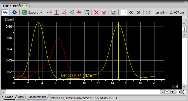
Figure 577. Z-Profile Graph using two profile lines
There are three tabs at the bottom of the Z Profile control window named Graph, Data, and Measurement. Switch from the default Graph tab to the Data tab. The number, X, Y, and Z coordinates of every point of the Z profile is displayed there in a table. They can be exported using the Export button described below.
Some measurement actions can be performed within the graph. The results are written to the Measurement tab.
Tools
 Hide/Show profile
 This button displays/hides the profile line inside the image window. The profile line can be dragged by mouse and the length can be modified. In the 3D Surface view mode (click  Show EDF 3D Surface View button on the image toolbar) the EDF Z-Profile plane can be moved by clicking Ctrl and dragging with the left mouse button.
Z-Profile Options The appearance and behaviour of the graph can be modified in the Z-Profile Options window. Press this button to display it or click the General Profile Properties... from the context menu over a profile line.
 Export
 Click this button to display a pull-down menu. The Graph image, graph data, and the measurement results can be exported:
The data and measurement tables can be exported to MS Excel. A new XLS sheet opens and the table is copied to it automatically. There is also the Export All To Excel option, which copies the data table, measurement table, and the graph image into it.
The data and measurement tables can be exported to an external *.txt file, the graph image to a *.bmp file. Select the command from the pull-down menu and define the target file name in a standard Save As-like window, which opens. Confirm the export by the Save button.
The data table, measurement table, and the graph image can be exported (copied) to Windows clipboard. Then the data or the image can be inserted into any appropriate application (text editor, spreadsheet processor, graphics editor) typically by the Paste command.
The Graph image can be exported into the Report Generator (see: Creating Reports).
The following interactive measurements can be performed within the graph. Please see the details in the Measurement on Graph chapter.
Note
Be aware that the scale in the X axis and the Y axis directions usually differ. In such case, the measured value does not match the angle displayed on the screen.
 Distance from Baseline
 Use this function to draw a red reference line (base line) by clicking and dragging in the graph area. Then click any other point(s) in the graph to measure its orthogonal distance to the base line. Finish the measurement by the secondary mouse click.
Clear Measurement Objects Deletes all the measured objects in the graph.
Reset Data Clears the table with the measurement results.
 Show Measurements
 Use this button to show a table containing results of measurements made in the graph.

 Shift Profile Line
 Enter the shifting step into the edit box (units are taken from the current image) and click on one of the arrows to move the profile line in the X axis.
 Show 1:1 Axis Ratio
 Sets the axis ratio of the graph to 1:1 so that both axes have the same calibration.
The Z-profile graph may be zoomed in the usual way. You can click the zoom buttons placed on the control window sides (please see the Image Window chapter for the buttons description) or a mouse wheel can be used:
Point to the target area and roll the mouse wheel. The graph will be zoomed in/out according to mouse wheel movement direction.
Zoom while holding the Ctrl key down.
Zoom while holding the Shift key down.
EDF Z-profile Options Click the Options button. A dialog appears where you can specify the Z- profile options:
General Options tab
Figure 578. Z-Profile Options dialog window.
Choose background, axes and grid colors from the palette. Check the Graph Title option to display a title, whose text you can enter in the adjacent field. Then check the Show Horizontal/Vertical Grid items if you want to make them visible in the graph. If X/Y Axis Always Visible item is checked, the axes do not leave the graph area while zooming in the graph.
Select interpolation method or drawing the graph lines by pressing the relevant button. You can choose Steps (rough), Linear (smoother), or Bicubic (really smooth) interpolation method.
Check this item to display data points. Small dots indicating the actual data values position can be displayed on the graph line. The points appear only if the distance between them is big enough for them to be recognized (they usually appear when you zoom in the graph).
Turning this option ON will make the graph lines look smooth.
Check this item to fill in the area under the line chart with a color. Select the amount of opacity used from the list of predefined values.
Defines the color and width of the profile line.
If this option is checked, the new graph measurement always overwrites the old one. If the function is not checked, measurement history remains in the graph.
X axis
Figure 579.
The Auto option enables that the range values are set automatically. On the contrary the range values can be set on Fixed values also. The range values can be set for minimum of X axis, maximum of X axis, major and minor grid of X axis.
If you select the Best Fit option, zoom of the X axis will be set to best fit. Otherwise you can set the Fixed range.
Y axis left
Figure 580.
The Graph Range and Zoom options are described above.
Set the line appearance - line color (in case color of image component is not set), thickness and style (solid, dot, dashed, dash-dot).
This control window displays the image intensity profile.
See Measure > Intensity Profile for more information.

(requires: Local Option)
Displays the Layer Thickness Measurement window. See Layer Thickness Measurement.

(requires: Local Option)
Opens the Measurement Explorer panel.
See also Measurement Explorer.

(requires: Local Option)
Opens the Measurement Sequencer - Definition panel used for the preparation of advanced sequential measurement definitions.

(requires: Local Option)
Opens the Measurement Sequencer - Run panel used for executing the measurement definitions previously defined in the View > Analysis Controls > Measurement Sequencer - Definition window.
(requires: Automatic Measurement)
This control window displays the objects present in the analyzed imaged. The Object Catalog is filled with objects at the measurement. The objects can be filtered and sorted. In the contextual menu are additional commands which enable object validation. If you place the mouse cursor over the image thumbnail, a window appears displaying the info about the object measured features.
Figure 581.
Top Toolbar
Press this button to fill the Object Catalog with data from Automated Measurement Results.
Choose the data source. Either the Object Count or the Automated Measurement data source is automatically set according to from which window was the Object Catalog invoked.
Press this button to change the Object Catalog Settings.
Press this button to adjust automatically orientation of all objects.
Select the sorting features (Feature of Interest, Ascending or Descending sort) from the pull down menu that appears after you press this item. The Feature of Interest item is available only for option Unsorted. It displays by which feature the objects are sorted.
Press this  button to define the filter. This button opens the Define Filter window.
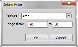
Figure 582.
Select a feature from the list of relevant features in the pull down menu and set the range values.
Note
When using the results from Object Count, the filtering options in Object Catalog are unavailable.
Press this  button to apply the filter set in the Define Filter window. To discard the filtering conditions, press this button once again. When filtering is active, the icon is highlighted red.
Note
When using the results from Object Count, the filtering options in Object Catalog are unavailable.
Edit the style of viewing the thumbnails.
Check this option to set the same zoom for all thumbnails.
Choose the thumbnail size: Icons, Small, Medium, or Large.
Press this  button to create a snapshot of all object in Object Catalog. A new image is created.
Press this  button to update object catalog.
Contextual Menu
Deletes selected objects.
Deletes all records in the Object Catalog.
Invalidates/validates selected objects.
Deletes invalid objects.
Move stage to object position.
Object Catalog Options
This window displays the Object Catalog setting.
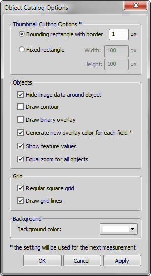
Figure 583.
Choose this option to let the thumbnails size reflect the size of objects. Define size of the border in micrometers.
Choose this option to display the thumbnails in rectangles with fixed size. Define the rectangle dimensions in micrometers.
Check this option to hide surroundings of the objects.
Check this option to draw the contours of object.
Check this option to display the binary overlay in the thumbnail image.
If you check this option, the objects will have unique overlay color for each measured field.
Check this option to show the feature value of object in left top corner of thumbnail.
This option makes the objects in the catalog comparable by size.
Check this option to show the thumbnails in regular square grid.
Check this option to draw grid lines between thumbnails.

(requires: Automatic Measurement)
The Object Count tool thresholds the image, automatically measures the binary objects, and exports the measured data to a file in a straightforward way.
See Object Count for detailed functionality description.
(requires: Automatic Measurement)
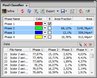
This control window displays the Pixel Classifier. Pixels can be classified according to selected features:
Figure 584. Pixel Classifier
Specify the number of phases by pressing and buttons. Finish the definition by clicking Define again.
Control Window Options - the Training Mode
Define Classifier This button switches between the standard and the training mode of the classifier. Click Define to start training the classifier.
These buttons are available only in the training mode. Use one of these buttons  ,
,  ,
,  and click into the image to select pixel(s) which will be used as samples for the current class.
 Reset samples
 Press this button to delete all samples from the current class.

 Undo/Redo
 Standard Undo and Redo commands.
 Smooth
 This command applies smooth operation on the classified objects. Choose the smooth strength from the pull-down menu next to the button.
 Show Scattergram
 This button displays the scattergram.
Keep Updating Classifier Press this button to run the classification continuously. Any changes in the image influencing the classification are shown immediately.
 Classify in ROI On/Off
 Press this button to determine if pixel classification is done only in ROIs (Classify in ROI On) or in the whole image (Classify in ROI Off).
Select a classification method of evaluating the binary objects. Manual enables defining the classes manually. If Bayes is selected, classes are defined via an algorithm for calculating classes from the defined samples.
Select which data are used for classification: Intensity; Channels; Hue, Saturation, Intensity (for RGB images); or Ratio from the picker. Then specify further details picking the appropriate item from the Channels menu.
This window contains list of all defined classes. When in the training mode, you can change the name or the displayed color of each class. If you check the Background option, the selected class is set as background. The Area values define size of the selected class area in proportion to the whole image and also in document units. Press the Test button to display classified objects in the image. Check the Show All option to display all classes in the image. If you do not check this option, only the currently selected class is displayed.
The slider on the left side defines scale of the histogram in the definition area. To define classes, drag the borders between them or set the value manually in the field which appears when you move your mouse cursor near the border line.
Control Window Options - Standard Mode
Update Classification Runs classification on the current image.
Classify ND image Runs classification on the whole ND2 file.
 Store classified data
 Saves current data from the classifier section into the stored data section.
Export Exports the data to a file, MS Excel or clipboard.
 Open / Save classifier
 Stores and imports the classifier settings.
This table contains all stored data.
 Show Area Fraction button converts the stored data into the proportion of the total area [%].
You can use the Remove Data button to remove the current row or the Remove All Data button to remove all data present in the table.
Pixel Classifier Scattergram
Scattergram window appears after clicking Show scattergram. Select two features which will be jointly represented in the graph. Press the  Show Grid button to display the grid. Press the button to display options defining the graph appearance.
Figure 585.
(requires: Automatic Measurement)
This panel applies limits to objects in the measurement results table. Only objects which fit these limits will remain in the table.
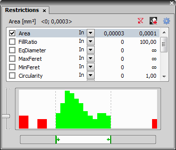
Figure 586.
How to Set Restrictions
Reset Resets all restrictions to to default values.
Generate Binary Using Restrictions Creates new binary layer using the set restrictions.
Select Object Features Selects the measurement features. The Measure > Object Features dialog box appears.

(requires: Automatic Measurement)
This control window provides thresholding tools.
See Thresholding for more information.

(requires: Measurement Sequencer)
Opens the Weld Measurement dialog window. See Weld Measurement.

Manages the visibility of all control windows.
The main portion of the window contains controls overview. All controls displayed in the application top toolbar are displayed here. You can add another control using the Customize button.
Pressing a control button results in displaying (or hiding already displayed) control window within the application layout.
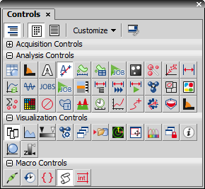
Figure 587.
Control Window Options
Show Groups Press this button to sort the controls displayed in the control window to groups (Acquisition Controls, Analysis Controls, ...). These groups can be expanded or collapsed by the +/- buttons. Items in each group are displayed in alphabetical order.
 Show Bitmaps
 Press this button to display the controls represented by their icon only.
Show Text Press this button to display the controls represented by their name only.
Press the Customize button to expand a menu containing all available control window sorted in four submenus. When you select any control from the submenu, the control is added to the control window overview portion and to the application top toolbar as well. The Add All Controls command adds all available controls to the overview and application toolbar at once. Similarly the Remove All Controls command removes all controls.
 Associate with Current Layout
 When this button is pushed, different contents of the control panel are saved for each layout.
Right-clicking on the buttons in the top application toolbar displays a context menu with the Remove This Button command enabling to remove the button from the toolbar.

This control window displays a histogram.
See Histogram for detailed window description.

This command shows the LUTs control docking window. Look-up tables are used for image color and brightness modifications.
See detailed description of LUTs functionality and control in the LUTs - Non-destructive Image Enhancement chapter.

This control window displays previews of all opened documents.
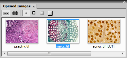
Figure 588.
You can customize display of image thumbnails. Use the buttons to change size of the thumbnail images. Thumbnails can be lined up in a single row or in multiple rows . Number of the rows depends on selected thumbnail size and size of the control window. Thumbnail size in a single row display depends on size of the window while the maximal size of thumbnails is given by the selected size button.
When you right click the image preview, a context menu appears with the following options:
Contextual Menu Items
Use the three top commands to create a reference image, to load the reference image and to switch between the current and reference image.
When you place the cursor over the image preview, a tooltip containing information about name, filename, path, dimensions, size, and calibration is displayed.
A scale can be displayed in the preview image. Its length is estimated automatically in order to be readable and depends on the image size. The units used depend on the image calibration.
Choose the rescaling method: linear or quick.
Displays the reference image in the window.
This command closes the opened image.
This command displays a dialog-window where all meta-information of the current image is shown. The dialog differs according to type of the image. All records are editable, some of them have predefined possible values. For more information see File > Image Properties.

Opens the Organizer pad for image files and database work. Please see Organizer for more information.

The preview control image shows a thumbnail of the whole image. The red rectangle indicates position of the currently observed area when the image is zoomed in. The size and position of this rectangle can be changed by mouse - the view of the image changes accordingly.
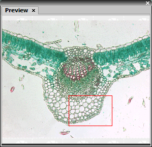
Figure 589.

This control window indicates the system state. You can display information about the session time, experiment time elapsed, X, Y, and Z position.
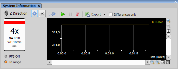
Figure 590.
The arrows indicates the motion. The Last move statement indicates that Z device has stopped moving. The arrow orientation indicates the direction of the motion. The Moving statement indicates that the Z device is moving up or down (again the arrow indicates the direction).
Settings Opens the Settings dialog which can be used to select basic system information which is displayed in the list of the System Information window.
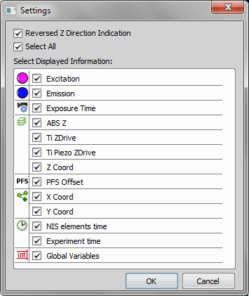
Figure 591.
Check this item to reverse the indication of Z moving.
Selects/deselects all items in the list.
Show/Hide Graph Displays/hides the graph view.
 Select Graph Variables
 Opens a dialog enabling to select which variables are shown inside the graph.
 Run
Run Starts to monitor selected variables and displays them in the Graph.
 Pause
Pause Pauses the variable monitoring.
Reset Resets the graph view.
Export Once the graph area is paused this function exports data/graph into MS Excel, clipboard or into a file.
If turned on, only changes of the variable are shown inside the graph (time is ignored).

(requires: Interactive Advanced Macro - API)
This control window displays a list of all recently executed commands and manages them. You can also use this control window to easily create a macro from a sequence of recently used commands.
See Macro > Command History for more information.

(requires: Interactive Advanced Macro - API)
The Debug View can be used to control the current macro execution. It displays the source code of the macro. When the macro runs, the executed line is indicated by an arrow. If there are any breakpoints put into the source code, the macro execution stops there.
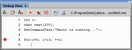
Figure 592.
The following buttons can be used to debug the macro:
 Go
Go Executes the macro from the current position to the end or to the nearest breakpoint.
 Next Step
 Executes the macro by the smallest steps. Each time the button is pressed, the execution moves one step forward.
 Interrupt Macro Execution
 Pauses macro execution.
 Add/Remove Breakpoint
 When a line is selected, a breakpoint is added/removed by pressing this button.
 Clear Breakpoints
 Removes all breakpoints from the current macro.
View Variables Opens the Variables control window.
Edit macro Opens the currently executed macro in a separate window. User can modify the macro.
See Also
View > Macro Controls > Variables 

(requires: Interactive Advanced Macro - API)
This control window displays chosen macros and/or commands as buttons. Macros and commands can be run by clicking on their button representative, or using a hotkey defined in the Setup Macro Panel.
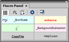
Figure 593.
Control Window Options
Regular Buttons Use this command to change size of the buttons to be the same width. When this button is not pressed, buttons wrap the title (a text or an icon) of the button.
Add Command This command opens the Paste Command dialog. You can choose a command, which is added to the Macro Panel.
Add Macro This command opens the Add Macro dialog. You can select a predefined, shared or recently used macro or a macro from a file, which is added to the Macro Panel.
Setup Macro Panel Opens the Setup Macro Panel window. You can manage the macros and commands and their properties.
Associate with Current Layout When this button is pushed, different contents of the control panel are saved for each layout.
How to add a command
How to add a macro
The buttons can be rearranged in the panel by drag and drop. Title of the button can be renamed using the Rename command from the context menu.
Setup Macro Panel Options
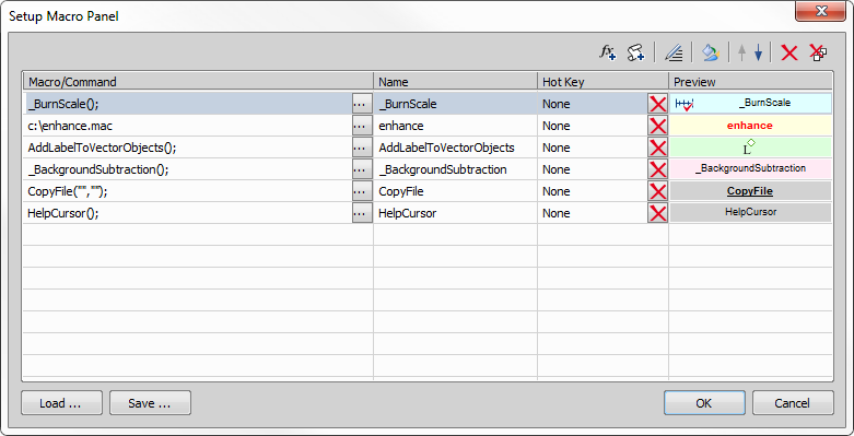
Figure 594.
Overview of added macros and commands is displayed in this window. Name of the command or full path to the macro is visible in the first column. The second column shows names of the commands/macros. The third column displays assigned hot keys. The forth column contains preview of the button in the Macro Panel. You can directly edit the name, hot key or preview, if you left-click the corresponding field of the selected command/macro.
Add Command Opens the Paste Command dialog.
Add Macro Opens the Add Macro dialog.
Edit Opens the Macro Editor window.
 Properties
 Opens the Properties dialog.
Moves the selected macro or command one line up/down.
Remove Removes selected command or macro.
Remove All Removes all commands and macros.
Loads the saved definition from an external XML file.
Saves the definition to an external XML file.
(requires: Interactive Advanced Macro - API)
The Variables control window displays values of variables present in the currently running macro. A control window with four tabs appears:
Figure 595.
This tab displays all user defined variables of the currently running macro and their values. If no macro has been run, the table is empty.
There are some variables predefined within NIS-Elements. Their current values are displayed in this table.
System constants are listed within this tab.
A selection of local and global variables can be displayed within this tab. Write a variable name to the Name field, or if you right click the variable name within the Locals/Globals tabs, a context menu appears with the Send to watch option to be selected.
This command toggles Look Up Tables. This command is equivalent to pressing the LUTs button, placed on the NIS-Elements main toolbar in the upper left corner. When LUTs are activated, this button turns red.
Note
To see how to set and use look-up tables, see LUTs - Non-destructive Image Enhancement.
This command runs the auto scale procedure permanently (on the live image). This command corresponds to the  button in the top document toolbar.
This command adjusts the white slider position of all channels automatically with the purpose to enhance the image reasonably. This command corresponds to the button in the top document toolbar.
This command shows the LUTs control docking window. Look-up tables are used for image color and brightness modifications.
See detailed description of LUTs functionality and control in the LUTs - Non-destructive Image Enhancement chapter.
This command defines a custom LUTs gradient. The left side of the window contains a list of all already defined gradients. Use buttons from the middle portion of the window to manage them. Start with creating a new gradient by clicking the button, name it and define its appearance in the right portion of the window which provides the gradient's overview. You can change the name of the gradient directly in the Name field. Then enter which pixel Intensity value is assigned to a selected color. After you fill in one row, another one is created automatically. When done with defining your gradient, you can press the button and choose the gradient from the LUTs window pull-down menu or it to your image immediately.
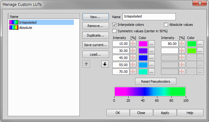
Figure 596.
Creates a new LUTs gradient. Enter the name of your gradient.
Removes the selected LUTs gradient.
Duplicates the selected LUTs gradient. New name needs to be filled in.
Saves the gradient to an external XML file.
Loads a previously saved gradient.
Up / Down arrows Clicking the arrow button moves the selected gradient one line up / down in the list.
Edit the name of your gradient in this field.
Check this item to make smooth color transitions between defined colors.
When checked, the gradient uses only discrete pixel intensity values with no color transitions between defined colors.
Defined colors are stretched symmetrically across the whole intensity range with 50% in the middle.
Define the range of pixel intensity (in percentage), which corresponds to the appropriate Color.
Use this color picker for selecting the pixel intensity value directly from the image.
Shows the chosen color. Press the ... button to choose an arbitrary color.
Use this button to reset the currently selected colors to a default gradient.
Displays the relevant help page.

Displays ND document in the main view. See ND Views for more information.

(requires: EDF Module)
This command displays a new window for exploring the slices of an ND2 file.
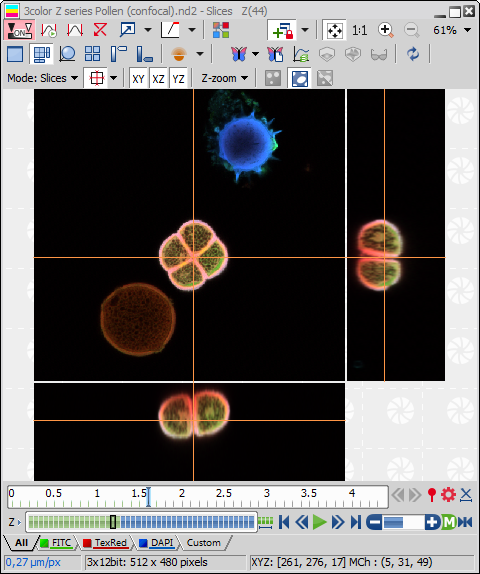
Figure 597.
This command shows or hides probe. It is equivalent to the  button placed as most upper on the right side of image window. To change the probe appearance, invoke the View > Layers Properties > Probe Properties command.
Displays graticules plane in a defined appearance. It is equivalent to the button placed in the right toolbar of the image window. To change the graticules plane appearance, invoke the View > Layers Properties > Graticules Properties command.
Displays/hides the scale. It is equivalent to the button placed in the right toolbar of the image window. To change the scale appearance, invoke the View > Layers Properties > Scale Properties command.
Context menu over a scale
Inserts the current scale layer into the image so that the scale becomes part of the image.
Moves the scale bar into its default position.
Locks/unlocks the scale bar in its position.
(requires: Automatic Measurement)
Displays/hides the measurement frame. When ON, binary objects outside the frame are omitted when performing automatic measurement. Actual settings of the frame behaviour can be set by the Measure > Options command. The frame size and position can be adjusted by mouse, or specified precisely within the Measure > Measurement Frame command window.
This command displays the LUTs color scale inside the current image. Positions of the Black, White, and Gamma sliders is indicated on the scale.
Note
The scale is available for monochromatic (gray-scale) images only.
This command displays/hides the annotation layer. It is equivalent to the  button placed in the right toolbar of the image window.
See Image Layers for further information.
(requires: Automatic Measurement)
Displays the area of measurement (measurement region of interest). See also Introduction to ROIs.
(requires: Automatic Measurement)
Displays the current binary image.
Note
The command corresponds to the binary button on the right side of the main NIS-Elements window. CTRL+B is the shortcut key.
(requires: Automatic Measurement)
Displays the current color image.
Note
It corresponds to the color button on the right side of the main NIS-Elements window. CTRL+R works as a shortcut key.
(requires: Automatic Measurement)
Displays both the current color and the binary image.
Note
It corresponds to the overlay button on the right side of the main NIS-Elements window. CTRL+V is the shortcut key.
(requires: Automatic Measurement)
This command changes the color of binary image displayed in the overlay mode. The overlay can be displayed in sixteen different basic windows colors.
(requires: Automatic Measurement)
This command decreases transparency of binary image displayed in overlay.
(requires: Automatic Measurement)
This command increases transparency of binary image displayed in overlay.
This command displays window for setting up the probe properties. You can reach this command by left-clicking on the Show probe button (located on the toolbar in image window) too.
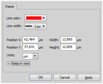
Figure 598.
Sets color of the boundary line.
Sets thickness of the boundary line.
Sets the position of x-coordinate of the top left corner of the probe rectangle.
Sets the position of y-coordinate of the top left corner of the probe rectangle.
Sets width of the probe.
Sets height of the probe.
If checked, the probe remains always visible while zooming and scrolling the image.
This command displays window for setting up the graticule properties. You can reach this command via context menu on the Show graticule button (located on the image toolbar).
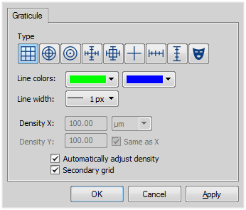
Figure 599.
Sets the type of displayed graticules:
Most grid types consist of primary and secondary lines. Their color can be selected from these pull-down menus.
The thickness of graticule lines can be selected.
The density value - the closest distance between two line intersections of a graticule - can be set in the edit box, or you can let NIS-Elements adjust it automatically according to the current zoom factor. The units selection depends on the image calibration (calibrated/uncalibrated).
Adds vertical lines to the grid.
This command displays a window with the scale properties.
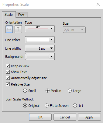
Figure 600.
Scale Tab Options
Sets the horizontal or vertical orientation of the scale.
Sets the shape of the scale.
Sets the size of the scale. If the Automatically adjust size option is ON, the Size edit box becomes disabled and the system computes the optimal size according to the image calibration and zoom factor.
Sets the scale bar color.
Sets the thickness of the scale bar line.
Sets the scale background color. This is handy if your image has lots of colors and it is difficult to choose a contrasting color for the scale.
This option dynamically places the scale so that it is always visible, even if you zoom in or shift the image.
This option hides/displays the scale legend.
Check this item to enable the automatic scale size adjustment based on the image calibration and zoom factor.
Size relative to the image width can be selected here. To enable this function check the above option first.
This option determines how the inserted scale will be resized - it can prevent inserting a too small or too large scale. Original burns the scale in the size as you see it in the image in the current zoom. Fit to Screen burns the scale as if you zoomed the image to the Fit to Screen mode and applied the Original method. 1:1 burns the scale as if you zoomed the image to 100% and applied the Original method.
Font Tab Options
Standard font properties of the scale legend can be adjusted within the Font tab:
(requires: Automatic Measurement)
This command displays the measurement frame and a window for setting up the measurement frame properties. It can be also displayed from the context menu on the Turn Frame on/off button on the right image toolbar.
Figure 601.
Sets the frame line color.
Sets the frame line thickness.
Sets the frame left corner coordinates.
Sets the frame dimensions.
You can select the units of the measurement frame. Pixels and the calibration units are available in case of a calibrated image.
This command displays a window for setting up the intensity profile properties. The appearance and behaviour of the graph can be modified in the Intensity Profile Options window. Press this button to display it from the control window. For more information see Measure > Intensity Profile .
The window contains three tabs:
General Options tab
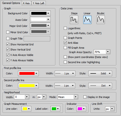
Figure 602.
Choose background, axes and grid colors from the palette. Then check the Show ... Grid items if you want to make them visible in the graph. Check the relevant .. Axis Always Visible item to make the axis always visible while zooming in the graph.
Select interpolation method for data treatment by pressing the relevant button. You can choose Steps, Linear, or Bicubic interpolation method.
Check to use logarithmic scale in the graph.
Check this item to display data points. Small dots indicating the actual data values position can be displayed on the graph line. The points appear only if the distance between them is big enough for them to be recognized (so they usually appear when you zoom in the graph).
Turning this option on will make the graph line edges look smooth.
Check this item to fill in the area under the line chart with a color. Select the amount of opacity used from the list of predefined values.
Check this item to display or hide X, Y coordinates of pixels in the Data tab of the Intensity Profile control window.
If two profile lines are used, this feature highlights the second line inside the graph view.
Set the profile line appearance. You can change its color, width and style, line thickness.
Note
These settings are applied to the profile line displayed over the image as well as to the graph lines, with only one exception: If image channels have their color specified (e.g. RGB image), the graph lines are displayed in this color and the color specified within this window is ignored.
By defining a neighborhood, you extend the source area from 1pixel line to a stripe. Specify the Width of the stripe and its units - in (pixels, microns) and select which value to display within the graph:
Check Display in the image to visually indicate the neighborhood in the image.
Note
If a custom value, which is not listed in the Width box, is entered, the neighborhood measurement may be performed in an area narrower than specified due to pixel truncation.
Define colors of lines and labels used in the graph when objects are measured.
When you click into the graph area, a vertical line appears in the graph and the “Indicator” appears in the image as well. Indicator is a line which displays the position on the profile line corresponding to the mouse position in the graph. You can select its color within this pull down menu.
Select pixels or the current calibration units for the Shift Left/Shift Right buttons in the tool bar.
X axis
Figure 603.
The Auto option enables that the range values are set automatically. On the contrary the range values can be set on Fixed values also. The range values can be set for minimum of X axis, maximum of X axis, major and minor grid of X axis.
If you select the Best Fit option, zoom of the X axis will be set to best fit. Otherwise you can set the Fixed range.
Y axis left
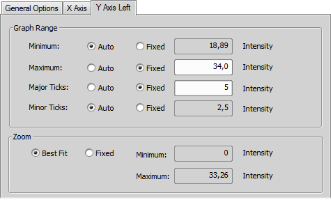
Figure 604.
The Graph Range and Zoom options are described above.
Set the line appearance - line color (in case color of image component is not set), thickness and style (solid, dot, dashed, dash-dot).
Set the second profile line appearance - thickness and style of the line (solid, dot, dashed,dash-dot). Check the Color highlighting to highlight the second profile line in the graph.

Hides all screen elements such as menus, buttons, status bar etc. To return the hidden elements to the screen press ESC key.
Adjusts the zoom factor to view exactly the whole image as big as possible.

Fills the screen with an image and crops the view of its marginal parts in one direction. The scroll bar appears on one side of the screen only.
Displays the window for setting options for Magnifier Glass tool. The Magnifier Glass can be activated by the button in the upper left corner of NIS-Elements screen.
Figure 605.
Magnification of Magnifier Glass.
Size of the Magnifier Glass.
Magnifier Glass can be either circular or square.
Color and thickness of border.
The image displayed in Magnifier Glass can be enhanced by gamma correction in order to see the details brighter. The value for gamma correction is set in the box below.
If checked, magnified image is shown next to the cursor whereas if unchecked, the magnified area is displayed around the center of the cursor.
This command displays all color channels of the current image in the overlay mode and can be used to select a single component to display.
In this menu it is possible to set the component to be shown and processed. Selected component is marked by the check mark on the right side. This command works the same way as switching the proper channel tabs manually in the image window.
Opens the Streaming Tool dialog window used for setting the streaming parameters. The stream is turned on by the View > Start Streaming function. Multiple users can access the streamed video signal and watch the screen of the streaming device. The stream can be password protected so that it is viewed only by clients knowing the password. To be able to use this function, Screen sharing option has to be selected during NIS-Elements installation.
Dialog Window Options
Internet - is used for streaming through an Internet service. In the Server drop-down menu, select a predefined Internet streaming service. Then click on the link below redirecting you to the website of the selected service. There you should register and acquire a streaming key. Enter this key into the Stream Key field. The button can be used to show the hidden characters.
Server - is used when the streaming server is installed on a different computer available on a network for NIS-Elements as well as for all clients. Enter the IP address into the Server edit box, check whether to access the stream with a password (Use Password) and click to register this copy of NIS-Elements for streaming on this server. To register this device on a different server, click . Click on the generated link to see the stream or use and send the address to all clients which are about to watch the stream. To be able to use this option, Streaming Server has to be installed (contact your distributor to acquire the installation file).
If turned on, cursor is included in the streaming video.
Starts streaming.
Closes the Stream Tool dialog window.