
 Results & Graphs

Display name of the experiment into the heading (#), a is a layout, 0 is the first pane (summary), 'Experiment name' is column name:
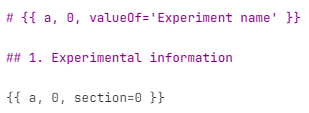
Figure 942.
Display dosing and labeling side-by-side, b is layout 1 is labeling pane and 2 is dosing pane (image at the top).
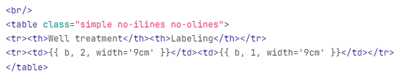
Figure 943.
Display all available features Dose response fit, a is layout 2 is fit plot pane, cycle will cycle over all available features.
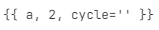
Figure 944.
Displaying a table, a is layout, 2 is table pane, number of rowHeaderCols=1 and custom table html style.
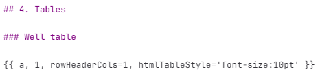
Figure 945.
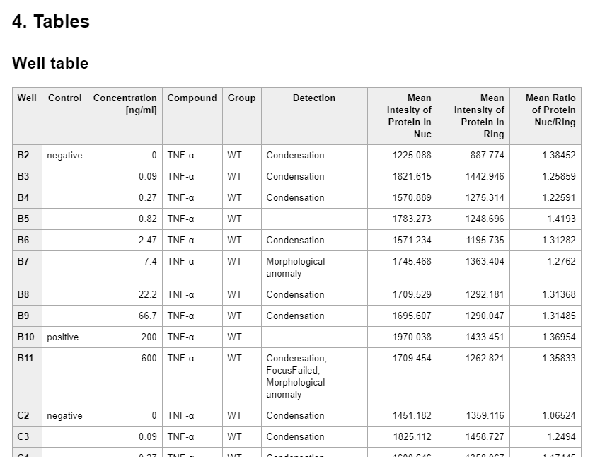
Figure 946.
Displaying small thumbnails, d is a table generated using ND Processing & Conversions > Render to Table > Render Frame node.

Figure 947.
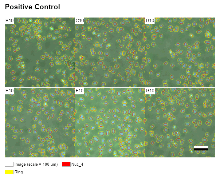
Figure 948.
Below is the default python which can be used as it is.
import importlib import limreport, limhtml # useful for development importlib.reload(limreport) importlib.reload(limhtml) # called for every {{ ... }} in MD def printToHtml(*args, **kwargs): return limreport.defaultPrintToHtml(*args, **kwargs) # if present called on final HTML def processHtml(html): # chromio v.83 doesn't support break-after, break-before: avoid-page # wrap <hN></hN><element></element> into: # <div class="lim-no-page-break-inside"><hN></hN><element></element></div> parser = limhtml.AvoidPageBreaks() parser.feed(html) return parser.output()For further info see the following files:
C:\Program Files\NIS Elements\Python\Lib\site-packages\limhtml.py C:\Program Files\NIS Elements\Python\Lib\site-packages\limreport.py C:\Program Files\NIS Elements\Python\Lib\site-packages\limtabledata.py
Heatmap of a property related to grid type patterns (wellplate) where x, y axes are mapped into columns and rows.
Tracking results with fixed number of tracks and time points can color code speed or other track properties at given time.
This graph is used for visualizing Y of ordinal X. Settings of each tab are described below:
General
Sets the title of the graph shown in the top.
Nesting specifies the order in which the columns are to be arranged (e.g. if all bars for column A and then all bars for column B, or if the bars for the columns should alternate, ...). Group labels and column titles can be turned on/off. Grouped records specifies how the bars are colored - by column or grouping. Padding specifies how much to separate the groups given by nesting.
Specifies whether the X and Y data labels are shown.
Determines the visibility and the position of the graph legend.
Data
Selects what data should be displayed (All data, Current frame, ...), i.e. the default value.
This tab is used to pair the graph axes with the variables available in the table input. Select a data variable and click on the arrow  next to the selected axis to assign it to this axis. Multiple variables can be assigned to the Y axes. To move the variable from the axis list back to the All Columns list, click
  or
or  to remove all. With a variable selected in the X/Y Axis list, Series style such as color and values. Error Bar section sets the error bar properties for the selected column. Choose an error column from the drop-down menu and optionally set its Color, Line width, and Whisker width.
Interaction
Defines the graph name in the layouts.
Defines the graph icon in the layouts.
Select which features will be available for selection in the first button above the graph in the Analysis Results window.
When having multiple charts/tables in the layout, they can synchronize with each other. Select the current frame for a table and the next chart will also show only data from the current frame.
Check the particular axis to add its interactive table column button above the graph.
Scales graph by all data in the accumulated table.

Adds interactive tools to the graph side bar.
Category axis, Left y-axis. Right y-axis
Defines the visibility and text of the axis label.
Defines the format and display precision of the tick labels.
In Auto mode, the minimal value for the range is set automatically. If switched to Fixed, a minimal value from which the data are visualized can be entered into the edit box.
In Auto mode, the maximal value for the range is set automatically. If switched to Fixed, a maximal value to which the data are visualized can be entered into the edit box.
Specifies the scale type - linear or logarithmic.
Reverses the values range from “min - max” to “max -min”.
In Auto mode, the major step value for the ticks and grid lines is set automatically. If switched to Fixed, a major step value used for the ticks and grid lines visualization can be entered into the edit box. If Tick is checked, a short tick is added to the axis next to each major step value. Checking Grid adds a grid line.
In Auto mode, the minor step value for the ticks and gridlines is set automatically. If switched to Fixed, a minor step value used for the ticks and gridlines visualization can be entered into the edit box. If Tick is checked, a short tick is added to the axis next to each minor step value. Checking Grid adds a grid line.
Provides a graphical representation of data where the individual values contained in a two-dimensional matrix are represented as colors from selected color gradient map. This graph does not support a grouped source table.
Settings of each graph tab are described below:
General
Sets the title of the graph shown in the top.
Defines the color palette used for visualising the graph data.
Sets the graph background color for missing values.
Data
Selects which data should be displayed (All data, Current frame, ...), i.e. the default value.
In Manual mode, data (column) selection is performed by the user, while in <Auto> mode, the selection is done automatically if the user has not chosen any data or if the selected data are invalid.
Interaction
Defines the graph name in the layouts.
Defines the graph icon in the layouts.
Select which features will be available for selection in the first button above the graph in the Analysis Results window.
When having multiple charts/tables in the layout, they can synchronize with each other. Select the current frame for a table and the next chart will also show only data from the current frame.
Scales graph by all data in the accumulated table.
Adds interactive tools to the graph side bar.
This graph is used for visualizing fitted curve.
Settings of each graph tab are described below:
General
Sets the title of the graph shown in the top.
Determines the visibility and the position of the graph legend.
Data
Selects what data should be displayed (All data, Current frame, ...), i.e. the default value.
This tab is used for selecting fitted equations to plot. Select a data variable and click on the arrow to assign it to Displayed Columns. Multiple variables can be assigned. To move the variable from the Displayed Columns list back to the Columns with Fitted Equation list, click or to remove all.
Interaction
Defines the graph name in the layouts.
Defines the graph icon in the layouts.
Allows the user to change the set Display Data directly in the chart (a drop-down menu appears at the top if something was checked). When having multiple charts/tables in the layout, they can Synchronize with each other. Select the current frame for a table and the next chart will also show only data from the current frame.
Facilitates the interactive data selection in the graph scene.


Adds interactive tools to the graph side bar.
This graph is used for visualizing distribution of data.
Settings of each graph tab are described below:
General
Sets the title of the graph shown in the top.
For numerical values set the bin count, eventually you can set the minimum and maximum. For string values enter the list used as a filter.
Data
Interaction
Defines the graph name in the layouts.
Defines the graph icon in the layouts.
Allows the user to change the set Display Data directly in the chart (a drop-down menu appears at the top if something was checked). When having multiple charts/tables in the layout, they can Synchronize with each other. Select the current frame for a table and the next chart will also show only data from the current frame.
Adds interactive tools to the graph side bar.
This graph is used for visualizing Y as function of X.
Settings of each graph tab are described below:
General
Sets the title of the graph shown in the top.
Defines the color palette used for visualising the graph data.
Defines the grouped source table behavior.
Specifies whether the X and Y data labels are shown.
Determines the visibility and the position of the graph legend.
Data
Specified what which data will be displayed in the table rows.
In Manual mode, data (column) selection is performed by the user, while in <Auto> mode, the selection is done automatically if the user has not chosen any data or if the selected data are invalid.
This part is used to pair the graph axes with the variables available in the table input. Select a data variable and click on the arrow next to the selected axis to assign it to this axis. Multiple variables can be assigned to the Y axes. To move the variable from the axis list back to the All Columns list, click or to remove all. With a variable selected in the X/Y Axis list, Series style such as color and values. Error Bar section sets the error bar properties for the selected column. Choose an error column from the drop-down menu and optionally set its Color, Line width, and Whisker width.
Interaction
Defines the graph name in the layouts.
Defines the graph icon in the layouts.
Select which features will be available for selection in the first button above the graph in the Analysis Results window.
When having multiple charts/tables in the layout, they can synchronize with each other. Select the current frame for a table and the next chart will also show only data from the current frame.
Check Show dropdown next to the particular side of the y-axis to add the interactive table column buttons above the graph.
Scales graph by all data in the accumulated table.
Adds interactive tools to the graph side bar.
X-axis, Left y-axis, Right y-axis
Defines the visibility and text of the axis label.
Defines the format and display precision of the tick labels.
In Auto mode, the minimal value for the range is set automatically. If switched to Fixed, a minimal value from which the data are visualized can be entered into the edit box.
In Auto mode, the maximal value for the range is set automatically. If switched to Fixed, a maximal value to which the data are visualized can be entered into the edit box.
Specifies the scale type - linear or logarithmic.
Reverses the values range from “min - max” to “max -min”.
In Auto mode, the major step value for the ticks and grid lines is set automatically. If switched to Fixed, a major step value used for the ticks and grid lines visualization can be entered into the edit box. If Tick is checked, a short tick is added to the axis next to each major step value. Checking Grid adds a grid line.
In Auto mode, the minor step value for the ticks and gridlines is set automatically. If switched to Fixed, a minor step value used for the ticks and gridlines visualization can be entered into the edit box. If Tick is checked, a short tick is added to the axis next to each minor step value. Checking Grid adds a grid line.
This graph is used for visualizing a cloud of points.
Settings of each graph tab are described below:
General
Sets the title of the graph shown in the top.
Defines the color palette used for visualising the graph data.
Defines the grouped source table behavior.
Specifies whether the X and Y data labels are shown.
Determines the visibility and the position of the graph legend.
Data
Specified what which data will be displayed in the table rows.
In Manual mode, data (column) selection is performed by the user, while in <Auto> mode, the selection is done automatically if the user has not chosen any data or if the selected data are invalid.
This part is used to pair the graph axes with the variables available in the table input. Select a data variable and click on the arrow next to the selected axis to assign it to this axis. Multiple variables can be assigned to the Y axes. To move the variable from the axis list back to the All Columns list, click or to remove all. With a variable selected in the X/Y Axis list, Series style such as color and values. Error Bar section sets the error bar properties for the selected column. Choose an error column from the drop-down menu and optionally set its Color, Line width, and Whisker width.
Interaction
Defines the graph name in the layouts.
Defines the graph icon in the layouts.
Select which features will be available for selection in the first button above the graph in the Analysis Results window.
When having multiple charts/tables in the layout, they can synchronize with each other. Select the current frame for a table and the next chart will also show only data from the current frame.
Check Show dropdown next to the particular side of the y-axis to add the interactive table column buttons above the graph.
Scales graph by all data in the accumulated table.
Adds interactive tools to the graph side bar.
X-axis, Left y-axis, Right y-axis
Defines the visibility and text of the axis label.
Defines the format and display precision of the tick labels.
In Auto mode, the minimal value for the range is set automatically. If switched to Fixed, a minimal value from which the data are visualized can be entered into the edit box.
In Auto mode, the maximal value for the range is set automatically. If switched to Fixed, a maximal value to which the data are visualized can be entered into the edit box.
Specifies the scale type - linear or logarithmic.
Reverses the values range from “min - max” to “max -min”.
In Auto mode, the major step value for the ticks and grid lines is set automatically. If switched to Fixed, a major step value used for the ticks and grid lines visualization can be entered into the edit box. If Tick is checked, a short tick is added to the axis next to each major step value. Checking Grid adds a grid line.
In Auto mode, the minor step value for the ticks and gridlines is set automatically. If switched to Fixed, a minor step value used for the ticks and gridlines visualization can be entered into the edit box. If Tick is checked, a short tick is added to the axis next to each minor step value. Checking Grid adds a grid line.
This graph is used for visualizing a cloud of points. Points can differentiate by size and color.
Settings of each graph tab are described below:
General
Sets the title of the graph shown in the top.
Defines the color palette used for visualising the graph data.
Defines the grouped source table behavior.
Specifies whether the X and Y data labels are shown.
Determines the visibility and the position of the graph legend.
Data
Specified what which data will be displayed in the table rows.
Select the default columns and optionally enable their interactive change in graph top tool bar. If the Show dropdown check box next to a column was checked, a tab appears below in the Table columns dropdowns section where you can select which features will be available in the Analysis Results drop-down menu.
Interaction
Defines the graph name in the layouts.
Defines the graph icon in the layouts.
Select which features will be available for selection in the first button above the graph in the Analysis Results window.
When having multiple charts/tables in the layout, they can synchronize with each other. Select the current frame for a table and the next chart will also show only data from the current frame.
Scales graph by all data in the accumulated table.
Adds interactive tools to the graph side bar.
X-axis, Y-axis
Defines the visibility and text of the axis label.
Defines the format and display precision of the tick labels.
In Auto mode, the minimal value for the range is set automatically. If switched to Fixed, a minimal value from which the data are visualized can be entered into the edit box.
In Auto mode, the maximal value for the range is set automatically. If switched to Fixed, a maximal value to which the data are visualized can be entered into the edit box.
Specifies the scale type - linear or logarithmic.
Reverses the values range from “min - max” to “max -min”.
In Auto mode, the major step value for the ticks and grid lines is set automatically. If switched to Fixed, a major step value used for the ticks and grid lines visualization can be entered into the edit box. If Tick is checked, a short tick is added to the axis next to each major step value. Checking Grid adds a grid line.
In Auto mode, the minor step value for the ticks and gridlines is set automatically. If switched to Fixed, a minor step value used for the ticks and gridlines visualization can be entered into the edit box. If Tick is checked, a short tick is added to the axis next to each minor step value. Checking Grid adds a grid line.
Color axis
Defines the visibility and text of the axis label.
Defines the label for the graph vertical color column.
Defines the color palette used for visualising the graph vertical column.
Specifies the scale type - linear or logarithmic.
Reverses the values range from “min - max” to “max -min”.
Use python matplotlib (MPL) to create any graph from the library. See the examples.
Example 16.
import pandas as pd
import numpy as np
from matplotlib.figure import Figure

# predefined globals:
# df: pd.DataFrame with the input table of input "a"
# mdf: pd.DataFrame with the input column metadata table of input "a"
# fig: Figure to be filled by this node
# axis_secs_to_HM(axis, major_secs=3600, minor_secs=None)
# style_figure(fig, icon: str = "") - set colors to the figure to match NIS colors

# generated data
x = [ 3600*i for i in range(10) ]
y = [ i**2 for i in range(10) ]

# plot the graph
fig = Figure(figsize=(12, 4))
ax = fig.add_subplot(1, 1, 1)
ax.plot(x, y, marker='o', linewidth=2)
ax.set_title("Object Count vs Time")
ax.set_xlabel("Time (hh:mm:ss)")
ax.set_ylabel("Count")
ax.grid(True)

# formats time axis from seconds to HH:MM
axis_secs_to_HM(ax.xaxis)

# set colors to the figure to match NIS light/dark colors
style_figure(fig)
The above python code produces following line chart.
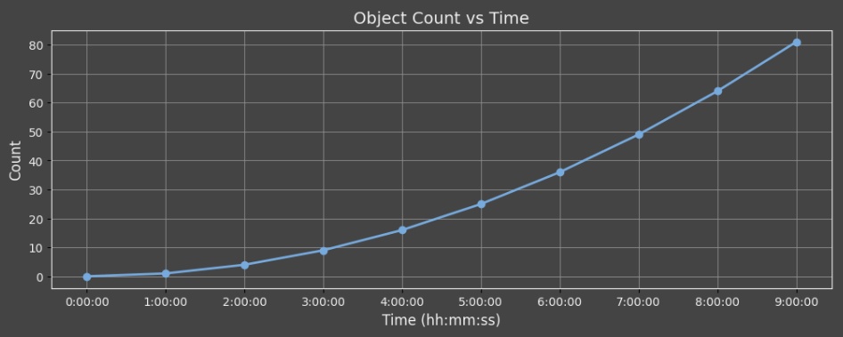
Figure 938.
Helper functions and variables
Below are global variables and functions available to the user code.
# used in figure rendering
# may be modified in the script
savefig_kwargs: dict = {
    'format': 'png',
    'bbox_inches': 'tight',
    'pad_inches': 0.25
}

# defualt color cycler
datacolors_light9 = [ ... ]

# color cycler for object IDs
datacolors_objects = [ ... ]

# color cycler for track IDs
datacolors_tracks = [ ... ]

datacolors = datacolors_light9
plt.rcParams['axes.prop_cycle'] = cycler(color=datacolors)

# converts seconds into HH:MM with optional major and minor tick period
def axis_secs_to_HM(axis, major_secs=3600, minor_secs=None):
    ...

def set_color_cycler_default(ax):
    ax.set_prop_cycle(cycler(color=datacolors))

def set_color_cycler_objects(ax):
    ax.set_prop_cycle(cycler(color=datacolors_objects))

def set_color_cycler_tracks(ax):
    ax.set_prop_cycle(cycler(color=datacolors_tracks))

# styles the figure so that it uses light/dark NIS scheme
# icon is one of "histo", "line" and "scatter"
def style_figure(fig, icon: str = ""):
    ...
USE LLMs with Python nodes
It is possible to ask large language models (LLMs) like ChatGPT, Gemini or Copilot to generate python code that will render the graph. To simplify the interaction with the LLMs there is a button which prepares a prompt ready to be pasted into the LLMs. The user has to replace the <USER TASK HERE> at the end of the prompt:
Task (provided by the user):
<USER TASK HERE>
Note that it is a good practice to create a new chat for the prompt so that it does not share context with unrelated conversation.
Copy and paste the python code – replace it: Ctrl+A, Ctrl+V.
Histogram
When the following question is added to the generated prompt:
Task (provided by the user):
Plot a histogram (PDF) of circularity in 20 bins.
Overlay it with a fitted gaussian curve with mean and stdev in the legend.
The ChatGPT 4o outputs code that produced following graph:
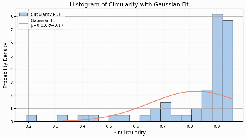
Figure 939. Histogram with Gaussian Fit.
3D plot
When the following question is added to the generated prompt:
Task (provided by the user):
Plot Bin shape factor vs. Circularity vs. Area into 3D scatterplot.
The ChatGPT 4o outputs code that produced following graph:
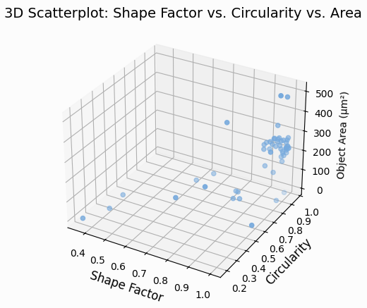
Figure 940. 3D scatterplot.
Specifies which results are displayed in the Main panel - View > Analysis Controls > GA3 Results - Main  (Left, Right inputs), Side panel - View > Analysis Controls > GA3 Results - Side (Side input) or Report panel (Report input).
Organizes input result panes or layouts side-by-side horizontally.
Displays well plate with one or more bars in each well. Any numerical column aggregated per well is suitable as input.
General
Sets the title of the graph shown in the top.
Overrides the overall minimum/maximum.
Displays the bars in a logarithmic scale.
Data
Selects what data should be displayed (All data, Current frame, ...), i.e. the default value.
Selects the features for the graph.
Interaction
Defines the graph name in the layouts.
Defines the graph icon in the layouts.
Allows the user to change the set Display Data directly in the chart (a drop-down menu appears at the top if something was checked). When having multiple charts/tables in the layout, they can Synchronize with each other. Select the current frame for a table and the next chart will also show only data from the current frame.
Select which columns can be interactively selected in graph top toolbar for each axis.
Enables the user to select the data columns.
Shown columns to force visible. The text is regular pattern that must match. Show takes precedence over hide.
Hidden columns to force not visible. The text is regular pattern that must match. Use “*” to select all columns in conjunction with show.
Facilitates the interactive data selection in the graph scene.
Displays well plate with bars stacked one over the other in each well. Any numerical column aggregated per well is suitable as input.
General
Sets the title of the graph shown in the top.
Overrides the overall minimum/maximum.
Data
Selects what data should be displayed (All data, Current frame, ...), i.e. the default value.
Selects the features for the graph.
Interaction
Defines the graph name in the layouts.
Defines the graph icon in the layouts.
Allows the user to change the set Display Data directly in the chart (a drop-down menu appears at the top if something was checked). When having multiple charts/tables in the layout, they can Synchronize with each other. Select the current frame for a table and the next chart will also show only data from the current frame.
Select which columns can be interactively selected in graph top toolbar for each axis.
Enables the user to select the data columns.
Shown columns to force visible. The text is regular pattern that must match. Show takes precedence over hide.
Hidden columns to force not visible. The text is regular pattern that must match. Use “*” to select all columns in conjunction with show.
Facilitates the interactive data selection in the graph scene.
Displays the well plate with a box plot in each well. Any box plot aggregated column per well is suitable as input.
Table
Sets the title of the graph shown in the top.
Overrides the overall minimum/maximum.
Data
Selects what data should be displayed (All data, Current frame, ...), i.e. the default value.
Selects the features for the graph.
Interaction
Defines the graph name in the layouts.
Defines the graph icon in the layouts.
Allows the user to change the set Display Data directly in the chart (a drop-down menu appears at the top if something was checked). When having multiple charts/tables in the layout, they can Synchronize with each other. Select the current frame for a table and the next chart will also show only data from the current frame.
Select which columns can be interactively selected in graph top toolbar for each axis.
Enables the user to select the data columns.
Shown columns to force visible. The text is regular pattern that must match. Show takes precedence over hide.
Hidden columns to force not visible. The text is regular pattern that must match. Use “*” to select all columns in conjunction with show.
Facilitates the interactive data selection in the graph scene.
Displays the well plate with dosing information: concentrations and positive/negative controls. It uses concentration, compound, group and control columns from a table typically produced by the Measurement > Metadata > Wellplate node.
General
Sets the title of the graph shown in the top.
Data
Selects what data should be displayed (All data, Current frame, ...), i.e. the default value.
Interaction
Defines the graph name in the layouts.
Defines the graph icon in the layouts.
Allows the user to change the set Display Data directly in the chart (a drop-down menu appears at the top if something was checked). When having multiple charts/tables in the layout, they can Synchronize with each other. Select the current frame for a table and the next chart will also show only data from the current frame.
Displays the well plate heat map. Any numerical aggregated column per well is suitable as input.
General
Sets the title of the graph shown in the top.
Overrides the overall minimum/maximum.
Shows color in a logarithmic scale.
Data
Selects what data should be displayed (All data, Current frame, ...), i.e. the default value.
Selects the features for the graph.
Interaction
Defines the graph name in the layouts.
Defines the graph icon in the layouts.
Allows the user to change the set Display Data directly in the chart (a drop-down menu appears at the top if something was checked). When having multiple charts/tables in the layout, they can Synchronize with each other. Select the current frame for a table and the next chart will also show only data from the current frame.
Select which columns can be interactively selected in graph top toolbar for each axis.
Enables the user to select the data columns.
Shown columns to force visible. The text is regular pattern that must match. Show takes precedence over hide.
Hidden columns to force not visible. The text is regular pattern that must match. Use “*” to select all columns in conjunction with show.
Displays the well plate with image and optionally binary overlay thumbnails. Any image thumbnail column is suitable. The thumbnail is typically produced by the Measurement > Metadata > Wellplate node.
General
Sets the title of the graph shown in the top.
Data
Selects what data should be displayed (All data, Current frame, ...), i.e. the default value.
Interaction
Defines the graph name in the layouts.
Defines the graph icon in the layouts.
Allows the user to change the set Display Data directly in the chart (a drop-down menu appears at the top if something was checked). When having multiple charts/tables in the layout, they can Synchronize with each other. Select the current frame for a table and the next chart will also show only data from the current frame.
Enables the user to select color channels and/or binary layers.
Data selection enables the user to select a row with a link into the image (selects objects or moves to the relevant frame).
Displays the well plate with labeling information: positive/negative controls, detection and custom labels. Uses detection and labeling columns from a table typically produced by the Measurement > Metadata > Wellplate node.
General
Sets the title of the graph shown in the top.
Data
Selects what data should be displayed (All data, Current frame, ...), i.e. the default value.
Interaction
Defines the graph name in the layouts.
Defines the graph icon in the layouts.
Allows the user to change the set Display Data directly in the chart (a drop-down menu appears at the top if something was checked). When having multiple charts/tables in the layout, they can Synchronize with each other. Select the current frame for a table and the next chart will also show only data from the current frame.
Enables the user to select color channels and/or binary layers.
Data selection enables the user to select a row with a link into the image (selects objects or moves to the relevant frame).
Displays the well plate with a chart visualizing Y as a function of X.
General
Sets the title of the graph shown in the top.
Data
Selects what data should be displayed (All data, Current frame, ...), i.e. the default value.
Select data for the x axis column.
Select data for the y axis column.
Interaction
Defines the graph name in the layouts.
Defines the graph icon in the layouts.
Allows the user to change the set Display Data directly in the chart (a drop-down menu appears at the top if something was checked). When having multiple charts/tables in the layout, they can Synchronize with each other. Select the current frame for a table and the next chart will also show only data from the current frame.
Select which columns can be interactively selected in graph top toolbar for each axis.
Data selection enables the user to select a row with a link into the image (selects objects or moves to the relevant frame).
Displays the well plate with violin plot in each well. Any violin aggregated column per well is suitable as input.
General
Sets the title of the graph shown in the top.
Data
Selects what data should be displayed (All data, Current frame, ...), i.e. the default value.
Selects the features for the graph.
Interaction
Defines the graph name in the layouts.
Defines the graph icon in the layouts.
Allows the user to change the set Display Data directly in the chart (a drop-down menu appears at the top if something was checked). When having multiple charts/tables in the layout, they can Synchronize with each other. Select the current frame for a table and the next chart will also show only data from the current frame.
Select which columns can be interactively selected in graph top toolbar for each axis.
Enables the user to select color channels and/or binary layers.
Shown columns to force visible. The text is regular pattern that must match. Show takes precedence over hide.
Hidden columns to force not visible. The text is regular pattern that must match. Use “*” to select all columns in conjunction with show.
Data selection enables the user to select a row with a link into the image (selects objects or moves to the relevant frame).
Table view for showing summary information in the form of two columns: header and value. The input to the summary table is a table which gets transposed in such a way that the column names become header and the first row values become values.
Data
Data to be displayed.
Shown columns to force visible. The text is regular pattern that must match. Show takes precedence over hide.
Hidden columns to force not visible. The text is regular pattern that must match. Use “*” to select all columns in conjunction with show.
Sections define the first rows of sections. Section is separated visually by an extra space.
Header suffix for all headers (e.g. “:”).
Interaction
Defines the graph name in the layouts.
Defines the graph icon in the layouts.
Allows the user to change the set Display Data directly in the chart (a drop-down menu appears at the top if something was checked). When having multiple charts/tables in the layout, they can Synchronize with each other. Select the current frame for a table and the next chart will also show only data from the current frame.
Table view for showing the data. Table columns can be resized, sorted, moved, filtered if enabled in the node. Statistics can be enabled as well.
General
Sets the title of the table shown in the top.
Show row index column in front of each row.
Enable sorting on all columns.
Enable resizing on all columns.
Data
Selects what data should be displayed (All data, Current frame, ...), i.e. the default value.
Interaction
Sets the title of the table shown in the top.
Defines the tab icon in the layouts.
Allows the user to change the set Display Data directly in the chart (a drop-down menu appears at the top if something was checked). When having multiple charts/tables in the layout, they can Synchronize with each other. Select the current frame for a table and the next chart will also show only data from the current frame.
Selects the statistics rows to be calculated.
Enables the user to select a row with a link into the image (selects objects or moves to the relevant frame).
CrossTab node is derived from Table (LimTable.js) and creates a PivotTable in JavaScript.
Pivot
General
Sets the title of the table shown in the top.
Show row index column in front of each row.
Enable sorting on all columns.
Enable resizing on all columns.
Data
Selects what data should be displayed (All data, Current frame, ...), i.e. the default value.
Interaction
Sets the name of the table shown in the top.
Defines the tab icon in the layouts.
Allows the user to change the set Display Data directly in the chart (a drop-down menu appears at the top if something was checked). When having multiple charts/tables in the layout, they can Synchronize with each other. Select the current frame for a table and the next chart will also show only data from the current frame.
Selects the statistics rows to be calculated.
Data selection enables the user to select a row with a link into the image (selects objects or moves to the relevant frame).
This node works like node Results & Graphs > Tables > Table, but you need to connect a table with measured statistics to it (e.g. from the Statistics node).
Creates a catalog of objects. The node has to be connected to the ND Processing & Conversions > Render to Table > Render Objects node.
Puts the connected results into a report which is defined in this node and shown in the Analysis Results tab. For details about defining the report, please see Report Editing.
Creates report as HTML document using Markdown template (MD), Python code and optional CSS.
Note
Currently the node is lacking interactive editing aids and this documentation is rudimentary. Therefore it should be used by advanced users only.
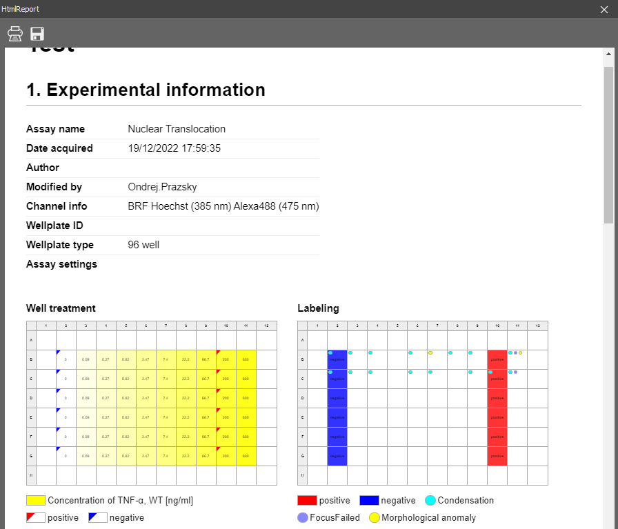
Figure 941.
The report connects to one or more table inputs (including layouts).
The MD template contains Markdown (may contain HTML) for static content and more or less sections enclosed in {{ }} which are replaced by dynamic content.
For every {{ arg0, ..., argN, kwarg0=value0, ..., kwargM=valueM }} section printToHtml(arg0, ..., argN, kwarg0=value0, ..., kwargM=valueM) is called.
By default it calls the limreport.defaultPrintToHtml() but can be overridden.
Typically arg0 is the name of the input a for A, b for B etc. If the input is a layout the arg1 should be the pane index counting from the left. Remaining parameters depends on the type of the input (graph, wellplate, table, summary).
Examples of MD template:
This graph is used for visualizing Y of ordinal X. Settings of each tab are described below.
General
Sets the title of the graph shown in the top.
Sets the inside color of the graph (color behind the visualized data).
Sets the outside color of the graph (frame around the visualized data).
Returns the colors to the default dark scheme.
Sets the color of the axes.
Sets the color of the texts.
Returns the colors to the default light scheme.
Sets the color scheme for the grouped data.
Shows data values directly in the graph.
Hides the legend.
Shows the legend inside the graph. Choose the legend position in the drop-down menu next to this option.
Shows the legend below the graph.
Sets the background color of the legend.
Sets the color of the legend text.
Data
This tab is used to pair the graph axes with the variables available in the table input. Select a data variable and click on the arrow next to the selected axis to assign it to this axis. Multiple variables can be assigned to the Y axes.
 button opens the Data Series dialog setting up the data series graph properties such as the color, line type, stroke type, line width, fill, marker type, and values type. Only the checked properties are visualized in the graph.
 button opens the Error Bar dialog setting up the error bar properties for the selected column. Choose an error column from the drop-down menu and optionally set its color, line width, and whisker width.

 buttons move the variable in the axis list up/down.
 button moves the variable from the axis list back to the All Columns list.
X Axis/Y Axis/Left Y Axis/Right Y Axis/Color Axis/Size Axis/Category Axis
Sets the title of the axis that is currently being set.
Reverses the range of the category axis.
Shows/hides the labels for the axis currently being set.
Specifies the axis label format for the axis currently being set.
Specifies the axis label numeral precision.
Specifies the step size of the category axis.
In Auto mode, the minimal value for the range is set automatically. If switched to Fixed, a minimal value from which the data are visualized can be entered into the edit box. Scale specifies the scale type - linear or logarithmic.
In Auto mode, the maximal value for the range is set automatically. If switched to Fixed, a maximal value to which the data are visualized can be entered into the edit box. Reversed Range reverses the values range from “min - max” to “max -min”.
In Auto mode, the major step value for the ticks and gridlines is set automatically. If switched to Fixed, a major step value used for the ticks and gridlines visualization can be entered into the edit box. If Tick is checked, a short tick is added to the axis next to each major step value. Grid color specifies the color of the grid line.
In Auto mode, the minor step value for the ticks and gridlines is set automatically. If switched to Fixed, a minor step value used for the ticks and gridlines visualization can be entered into the edit box. If Tick is checked, a short tick is added to the axis next to each minor step value. Grid color specifies the color of the grid line.
Provides a graphical representation of data where the individual values contained in a two-dimensional matrix are represented as colors from selected color gradient map. This graph does not support grouped source table A.
All tabs are closely described in the Results > Graphs > Barchart node.
Typical Usecases
This graph is used for visualizing Y as function of X.
All tabs are closely described in the Results > Graphs > Barchart node.
This graph is used for visualizing a cloud of points. If the source table A is grouped the graph shows them in colors.
All tabs are closely described in the Results > Graphs > Barchart node.
This 3D graph is used for visualizing a cloud of points. The third axis is visualized using a color gradient. This graph does not support grouped source table A.
All tabs are closely described in the Results > Graphs > Barchart node.
This 3D graph is used for visualizing a cloud of points. The third axis is visualized using disks of different size. This graph does not support grouped source table A.
All tabs are closely described in the Results > Graphs > Barchart node.
Depicts groups of numerical data through their quartiles as a box plot. It shows minimum, first quartile, mean, third quartile and maximum. It can optionally show outliers. If the source table A is grouped the graph shows one box for each group.
All tabs are closely described in the Results > Graphs > Barchart node.